Tag Archives: Computational Biology

Where Art Meets Science: The Communities Behind Biological Visualizations

Ever since my time in a crystallography lab, I’ve been fascinated by the process of translating raw diffraction patterns into detailed structural models.
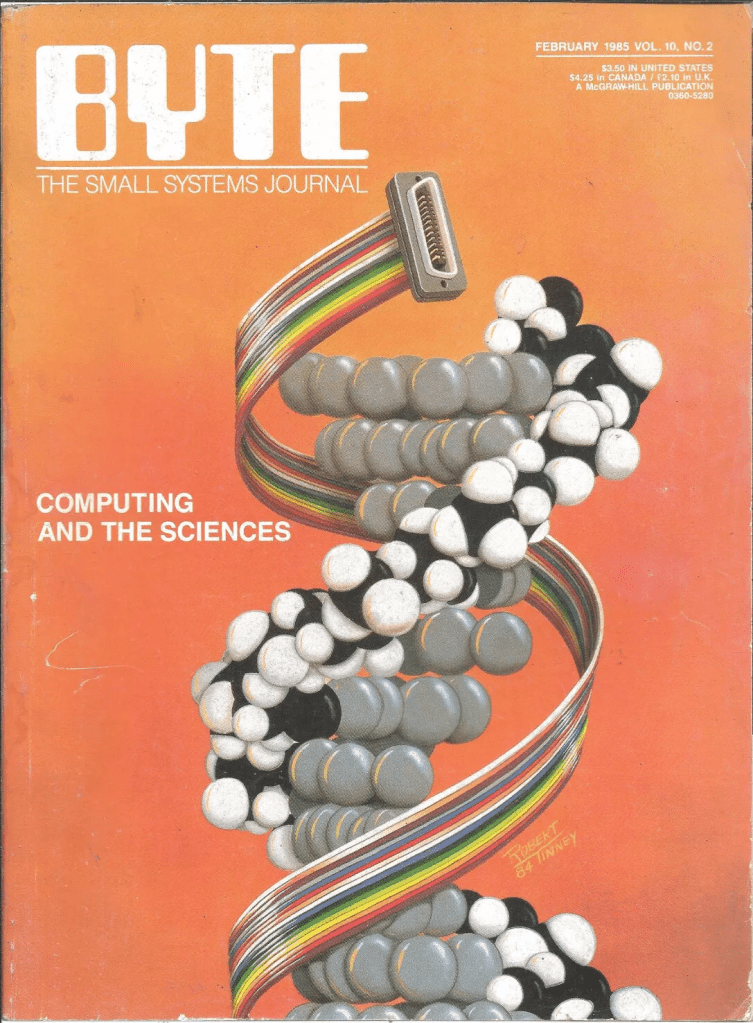
Back then, we relied on those cool SGI (Silicon Graphics, Inc.) computers—high-performance machines that were the go-to for graphics and visualization in the late ’90s and early 2000s. These workstations were the backbone of many scientific labs, enabling us to visualize complex molecular structures in ways that were groundbreaking at the time.

Even at that time, I was captivated by the pursuit of renders that were more than just scientific models—they were almost eye candy, visually arresting representations of the intricate dance of atoms. These weren’t just static arrangements; they were the keys to understanding quantum-scale processes. I found myself wondering: What do these molecular machines really look like? Are they transparent? Gooey?

At the time, most people stuck with the ball-and-stick method of molecular rendering, and sometimes the very creative ribbon method for visualizing secondary structures like α-helices and β-sheets. This ribbon method, first introduced by Jane Richardson in the 1980s, revolutionized how we perceive and depict the elegant architecture of proteins.

I was particularly struck by a talk she gave a few years ago at the Machine Learning in Structural Biology (MLSB) workshop, which is part of the broader NeurIPS (Conference on Neural Information Processing Systems). The presentations at MLSB highlight how the intersection of machine learning and structural biology is opening up new avenues for visualizing and understanding complex biological data—building on the foundations researchers laid with creative solutions like the ribbon diagrams decades earlier. You can still view a recording of the entire Richardson talk here.

Fast forward a few years, and I find myself reminiscing about the times when Sonic Youth was the soundtrack to my late-night coding sessions, and I was drawn to ideas about being in the flow, letting go, and just being present in the moment. These days, hanging out with my wife and child brings that same sense of peace and connection. But as much as I cherish these moments, there’s something uniquely exhilarating about attending conferences, where you get to “talk shop” and be exposed to the latest innovations.

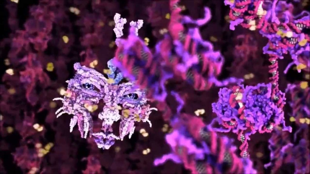
I remember the first time I saw molecular renderings by Drew Berry—it was at a VIZBI conference, a gathering that perfectly blends scientific rigor with creative visualization. VIZBI (Visualizing Biological Data) is more than just a conference; it’s an international meeting point for the best minds in science, bioinformatics, and data visualization. What makes VIZBI special is its emphasis on both the scientific and artistic aspects of data visualization.

The conference not only showcases cutting-edge visualizations that transform how life scientists view and interact with data, but it also encourages a deeper appreciation for the aesthetic quality of these visualizations. This was evident in Drew Berry’s work, which brought the molecular world to life in a way I had never seen before. The structures didn’t just sit there; they vibrated, darted around, and had this incredible “stochastic” feel to them, capturing the chaotic energy that defines molecular interactions. It was like seeing the molecules not just as static models, but as living entities, each with its own rhythm and motion. VIZBI isn’t just about keeping up with the latest research; it’s about being inspired, about seeing the boundaries of science and art blur in ways that open up new possibilities for how we understand life at its most fundamental level. It’s the kind of experience that reminds me why I got into this field in the first place.
In the last couple of years, BioVis has really stepped up its efforts to engage the community, working closely with other organizations like IEEE and ISCB to keep the spirit vibrant and interdisciplinary. BioVis has taken on the challenge of pushing forward the frontiers of biological data visualization, encouraging collaboration across fields and nurturing a community that is as diverse as it is innovative.

By bringing together visualization researchers with biologists and bioinformaticians, BioVis has managed to keep the conversation fresh and evolving, ensuring that new methods and ideas keep flowing. It’s exciting to see how these gatherings—both old and new—continue to energize the community and drive progress in understanding the complexities of life at every scale.

And hey, these are just some of the meetings out there, but they are my personal favorites. Even with incredible advancements like AlphaFold, RoseTTAFold, and ColabFold, which have made huge leaps in predicting molecular structures, there is still something uniquely thrilling about the art of representation. For me, that thrill is often fueled by the same sense of awe I get from playing video games. A good game isn’t just about throwing the newest engine at it; it’s about the aesthetics, the art, and the way it all comes together. That’s what makes good games age well—and I think it’s the same with science.

As the saying goes: sometimes, it’s less about where the path leads and more about the wonder found along the way.

Leave a comment

Filed under CS, Microbiology

Mapping KEGG Pathway Interactions with Bioconductor

Continuing from the previous post[1], dealing with structural effects of variants, we can now abstract one more level up and investigate our sequencing results from a relational pathway model.

Global Metabolic Pathway Map of H.sapien by Kanehisa Laboratories

Global Metabolic Pathway Map of H.sapien by Kanehisa Laboratories

The Kyoto Encyclopedia of Genes and Genomes (KEGG) has become an indispensable resource which has laboriously, and often manually, curated high-level functions of biological systems. Bioconductor, though not as essential as KEGG, provides some valuable tools when utilizing graph-theory for genomic analysis. If your data is well annotated and you happen to care about high-level genomic interactions, then you may have pathway annotations, containing data like the following:
KEGG=hsa00071:FattyAcidMetabolism;
KEGG=hsa00280:Valine,LeucineAndIsoleucineDegradation;
KEGG=hsa00410:betaAlanineMetabolism;

KEGG IDs can be stored on an external file separate from the sequence data they are derived from. Though, storing the IDs with their respective variant is helpful, and it is possible to maintain VCF 4.1 specifications.

KEGG with VCF 4.1

KEGG Annotations in VCF 4.1

As most Bioconductor tools are based on the R programming language, having an updated installation is recommended, this post uses version 3.0.1 “Good Sport”. Creating interaction maps with KEGG data will require three packages: KEGGgraph, Rgraphviz, and org.Hs.eg.db. These packages can be downloaded as separate tarballs, however installation from within R is likely best:
$R
source("http://bioconductor.org/biocLite.R")
biocLite("KEGGgraph")
library(KEGGgraph)

Using the method above for all three. KEGG relational information is stored within XML files in the KEGG Markup Language. KGML files can be accessed through several methods, including directly from R, FTP, and subjectively the best method with REST-style KEGG API.

Screen Shot 2013-08-27 at 2.26.09 PM
Bioconductor packages downloaded above come with a few KGML files pre-loaded, which can be viewed with the following command, it is also important to note that KGML files we want to use should be placed in this directory to avoid any unnecessary errors.
$R
dir(system.file("extdata",package="KEGGgraph"))
$../Resources/library/KEGGgraph/extdata/

In this post the branched-chain amino acid (BCAA) degradation pathway, which has a KEGG ID of hsa00280, will be mapped in relation to variants from the BCKDHA gene.
$R
[var1] <- system.file(".xml",package="KEGGgraph")
[var2] <- parseKGML2Graph([var1], genesOnly=TRUE)
[var3] <- c("[KEGG-Gene-ID]",edges([var2])$'[KEGG-Gene-ID]')
[var4] <- subKEGGgraph([var3],[variable2])
[var5] <- sapply(edges([var4]), length) > 0
[var6] <- sapply(inEdges([var4]), lendth) > 0
[var7] <- [var5]|[var6]
[var8] <- translateKEGGID2GeneID(names([var7]))
[var9] <- sapply(mget([var8],org.Hs.egSYMBOL),"[[",1))
[var10] <- [var4]
nodes([var10]) <- [var9]
[var11] <- list();
[var11]$fillcolor <- makeAttr([var4],"[color]")
plot([var10], nodeAttrs=[var11])

Executing these steps will result in a graph whose nodes and edges should help clarify any relevant connections between the genomic regions in question.

Screen Shot 2013-08-27 at 5.49.31 PM

Results

While dynamic visualization tools (e.g. Gephi, Ayasdi, Cytoscape) look similar, and with some work utilize KEGG, they may lack the specificity and control which Bioconductor  provides due to its foundations in R. These methods are necessary to understand more than just metabolic diseases, they also play a crucial role in drug interactions, compound heterozygosity/complex non-mendellian traits, and other high-level biological functions.

Leave a comment

Filed under Genomics

Exome Sequence Assembly Utilizing Bowtie & Samtools

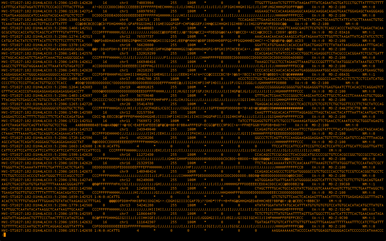
OG BrowserAt the end of all the wet chemistry for a genome sequencing project we are left with the raw data in the form of fastq files. The following post documents the processing of said raw files to assembled genomes using Bowtie & Samtools.

Raw data is split into approximately 20-30 fastq files per individual

Each of these raw files, once uncompressed, contains somewhere around 1 gigabyte of nucleotide, machine, and quality information. Which will follow the fastq guidelines and look very similar to the following. It’s quickly noticeable where our nucleotide data consisting of ATGC lives within these raw files.

@HWI-ST1027:182:D1H4LACXX:5:2306:21024:142455 1:N:0:ACATTG
GATTTGAATGGCACTGAATATACAGATCAACTTGAAGATAACTGATATCTAAACTATGCTGAGTCTTCTAATTCATGAACACAGTACATTTCTATTTAGG
+
@?<DFEDEHHFHDHEEGGECHHIIIIIGIGIIFGIBGHGBHGIE9>GIIIIIIIIIIIFGEII@DCHIIIIIIGHHIIFEGHBHECHEHFEDFDFDCEE>
@HWI-ST1027:182:D1H4LACXX:5:2306:21190:142462 1:N:0:ACATTG
GCCCTTTTCTCTCCCAGGTGGGAGGCAGATAGCCTTGGGCAAATTTTCAAGCCCATCTCGCACTCTGCCTGGAAACAGACTCAGGGCTATTGTGGCGGGG
+
CCCFFFFFHHHHHJJJJJEGIJHIJJJIJHIJJJJJJJJJJIJJJJIJJJJIJJJJJJIIJHHHFFFFFFEDEEECCDDDDDDDDDDDDDDDEDDBDDB#

At this point the raw reads need to be assembled into contiguous overlapping sets, then chromosomes, and finally the entire genome. There are two general approaches here, template-based and de novo assembly. For this particular exome data set it is prudent to move forward with template-based assembly using the latest build of the human reference genome. An index of the reference genome must be built for bowtie, some indexes are also available for download though the file size can be quite large.

$ bowtie-build /Users/mokas/Desktop/codebase/max/hg19.fa hg19
Settings:
 Line rate: 6 (line is 64 bytes)
 Lines per side: 1 (side is 64 bytes)
 Offset rate: 5 (one in 32)
 FTable chars: 10
...
Getting block 6 of 6
 Reserving size (543245712) for bucket
 Calculating Z arrays
 Calculating Z arrays time: 00:00:00
 Entering block accumulator loop:
 10%
 20%
...
numSidePairs: 6467211
 numSides: 12934422
 numLines: 12934422
Total time for backward call to driver() for mirror index: 02:00:28

The entire reference build should be complete within an hour or two, which may be faster than downloading an pre-built index. At this point the raw fastq file is ready to be processed using our indexed template.

$ bowtie -S [ref] [fastq] [output.sam]

At the end of this step we will have a .sam (Sequence Alignment Map) file, which will have each of our raw reads aligned to certain positions on the human reference. However, the reads will be in no useful order, and all the chromosomes and locations are mixed together.
To be able to move through such a large file with speed and ease it must be converted into a binary format, at which point all the reads can be sorted into a meaningful manner.

$ samtools view -bS -o [output.bam] [input.sam]
$ samtools sort [input.bam] [output.sorted]

We are now left with a useful file where our raw reads are assembled and sorted based on a template.

This file can be visualized and analyzed in a wide variety of available programs, the format is also accessible enough to quickly build your own tools around it. Once each of the 20-30 fastq files in a single sample have been processed in this manner the files can be merged, converted into binary for reduced file size, and indexed for quick browsing. IGV is one of the more useful browsers as a result of its simplicity and ability to quickly jump around all along the genome. Getting a cursory looks at how an assembly went.

Integrative Genomics Viewer

This post is the part of a set providing initial documentation of a systematic comparison of various pipelines with a wide range of algorithms and strategies. Check out the next post in the series on assembly with BWA & Picard.

2 Comments

Filed under Genomics

Virtualization of Raw Experimental Data

Earlier today it was announced that the 2012 Nobel Prize in Physiology/Medicine would be shared by Shinya Yamanaka for his discovery of 4 genes that could turn a normal cell back into a pluripotent cell. 

An effect originally shown by John B. Gurdon with his work on frog eggs over 40 years ago. The NCBI’s Gene Expression Omnibus (GEO) database under accession number GSE5259 contains all 24 candidate genes that were suspected to play a role in returning a cell to a non-specialized state. A practical near-term impact of the research however may be overlooked. That is you can have all of Dr. Yamanaka’s experimental DNA microarray data used in making the prize winning discovery.

Unless you’ve been living under a rock on Mars, or you don’t care what dorky scientists are up to, then you may have heard of the ENCODE project. The Encyclopedia of DNA Elements isn’t winning any Nobel Prizes, not yet anyways, and if what many researchers believe to be true, it never will. All the datasets can be found, spun up, played with, and used as fodder for a new round of pure in silico research from the ENCODE Virtual Machine and Cloud Resource.

What ENCODE and the Nobel Prize in Medicine have in common is ushering in a new paradigm of raw experimental data/protocol/methodology sharing.  ENCODE, which generated huge amounts of varied data across 400+ labs has made all of the raw data available online. They go one step further to provide the exact analytic pipelines utilized per experiment, including the raw datasets, as Virtual Machines. The lines between scientist and engineers are blurring, the best of either will have to be a bit of both. From the Nobel data, can you find the 4 genes out of the 24 responsible for pluripotent mechanisms? Are there similarly valuable needles, lost in the haystack of ENCODE data? Go ahead, give it a GREP through.

Citations:

Leave a comment

Filed under Genomics, Microbiology

The Fall in Gov Funding & Rise of Privatization in Genome Databases

Government Funded Sequence Database

As the spaceshuttle program comes to an end we are reminded of the role of goverments in birthing industries. And just like the manned space program, genomics has been mostly government funded and just like the space program it’s about to take a big hit:

Recently, NCBI announced that due to budget constraints, it would be discontinuing its Sequence Read Archive (SRA) and Trace Archive repositories for high-throughput sequence data. However, NIH has since committed interim funding for SRA in its current form until October 1, 2011.

With its fall there will be few if any (Japan: DDBJ & Europe: ERA) centralized public databases for nextgen sequencing. Once again we’re left to ride with the ruskies, figuratively speaking. Enter private industry and its first batter, from the SF Bay Area, DNA Nexus. Though Sundquist and his team have managed to create a very well polished and modern platform, unlike SRA there is no data aggregation. There is no public pool where researchers can access data. This is a problem in that much of the power of genomics comes from studying statistical trends and a large, public data pool is to date the best way to make any sense of what our genes say.

A similar private effort from the great innovators across the ocean comes in the form of Simbiot by Japan Bioinformatics K.K. At the moment Simbiot is edging a lead as they’ve recently released two mobile applications allowing sequence data management and analysis on the go. However, just as with DNA Nexus users are only given the option to keep their data within their own accounts or share with select others. Both of the aforementioned companies have well thought-out price plans, sleek interfaces and well produced videos. But what makes government efforts like the SRA valuable is that for a time they provided a centralized public data pool.

Said Infamous Graph

As anyone who’s seen the now infamous graph of the rate of decrease in sequencing costs vs that of Moore’s law will likely have figured out by now, the costs associated with maintaining a sequencing database only increases with adoption of the technology. As such, it was reasonable for Uncle Sam to pay for this party at first but the costs rise every year, by leaps. There must be a private model that is both aggregate & open in nature but can also pull it’s own weight in terms of cost; the future of healthcare and any form of “genomics industry” may well be dependant on it.

2 Comments

Filed under Genomics

Decided? No, we just finished saying Good Morning: Sage Congress 2011

“Therefore a sage has said, ‘I will do nothing (of purpose), and the people will be transformed of themselves; I will be fond of keeping still, and the people will of themselves become correct. I will take no trouble about it, and the people will of themselves become rich; I will manifest no ambition, and the people will of themselves attain to the primitive simplicity’ ”  reads Ch. 57 of the Tao Te Ching. How chillingly the 2 millennia old caricature of a wise-learned man holds true to this day.

Sage Bionetworks is a medical research organization, whose goal is “to share research and development of biological network models and their application to human disease and biology.” To this end, top geneticists, clinicians, computer scientists and pharmaceutical researchers gathered this weekend at UC San Francisco. We were given an inspirational speech by a cancer survivor, followed by report of the progress since last years congress. Although admirable on their own, the research and programs built in the last year seemed to remind us all again that in silico research was still closer to the speed of traditional life-science than the leaps and bounds by which the internet moves.

Example of an effort which aligns with & was presented at Sage

Projects like GenomeSpace by the Broad Institute give us hope of what’s possible while watching hours of debate and conjecture at Sagecon.  There were many distinguished scientists, authors , nobel laureates and government representatives, the totality of whose achievement here was coming to agreement on what should be built, who should build it and by when. Groups were divided into subgroups, and then those divided yet again. All the little policy details, software choices and even funding options would be worked out. There was a lot of talk.

Normal Conference VS Developer Conference. SHDH Illustrated by Derek Yu

Attending gatherings for software developers in silicon valley, their hackathons leave much to be desired at events like Sagecon, the least of which being the beer. I doubt anyone enjoys sitting in a stuffy blazer listening to talks for hours on end. The hacker events are very informal, there is no set goal, yet by the end of 24 hours there are often great new programs, friendships and even companies formed. Iteration rate is key to finding solutions and the rate-limiting step in the life-sciences & medicine isn’t the talent or resources it’s the culture; an opinion echoed by Sages’ own shorts-wearing heroes Aled Edwards & Eric Schadt.

“You must understand, young Hobbit, it takes a long time to say anything in Old Entish. And we never say anything unless it is worth taking a long time to say. “

Leave a comment

Filed under Genomics, Microbiology

Biotech for Hackers: Computational Genomics 1 of 2

A low hurdle to entry along with the ability to iterate rapidly is key to taking on problems & creating solutions. What do these solutions look like in genomics and why can hackers lead the way? Fig 1 shows something very similar to social interaction maps one comes across at places like Facebook.

Fig 1: Interaction map of genes implicated in Alzheimer's. Genes were grouped by those that have similar functions (squares) and those with different functions (circles). Modules with a red border have high confidence interactions. While the weight of the connecting green lines corresponds to the number of interactions between two sets.

The map above is of individual gene relationships where an algorithm began with 12 seed genes that previous experiments have shown to play a role in Alzheimer’s disease. These seeds were compared with 185 new candidate genes from regions deemed susceptible to carrying Alzheimer’s genes. From here, both experimental and computational data was combined to generate Fig 1, which the authors dubbed AD-PIN (Alzheimer’s Disease Protein Interaction Network).

Fig 2: Interactions discovered by the Hig-Confidence (HC) set generated by this study in context to known relationships in the Human Interactome (created in past studies).

What we learn by simply tracking genes already known to play a role in Alzheimer’s is the discovery of new regions of genetic code that are  also participating in the expression of related functions, in this case those being affected by the disease, such as memory. In Fig 2 we see that between seeds this algorithm produced 7 high confidence interaction results, of which 3 were  in common with previous studies. In addition to almost 200 new interactions, which can each lead to new therapies, blockbuster drugs and better understanding of the disease itself.

Many software developers have extensive experience and interest in dealing with large data sets, finding correlations  and creating meaningful solutions. However, much of our generation has had little exposure to these problems. Often resulting in the bandwagon effect, as one recent article put it “the latest fucking location fucking based fucking mobile fucking app.” Progress has often been linked to literacy, from books to programming, being able to read and write in life-code just might be the next stage.

Original published study: Interactome mapping suggests new mechanistic details underlying Alzheimer’s disease by Soler-Lopez et al.

1 Comment

Filed under Genomics