Hadfield et al. https://doi.org/10.1038/s41576-019-0150-2More and more, as we begin to get a solid grasp on DNA sequencing people are finding the need to understand what makes each type of cell different, or what changes occur before/after the introduction of a therapeutic. Of course, the answers are most likely in RNA, as the DNA is our permanent record, and the RNA is what is being worked with at any given moment. So, RNA sequencing has become more and more popular; however, trying to make sense of the data and actually understand what it is our machines are picking up has introduced a whole suite of challenges to overcome.
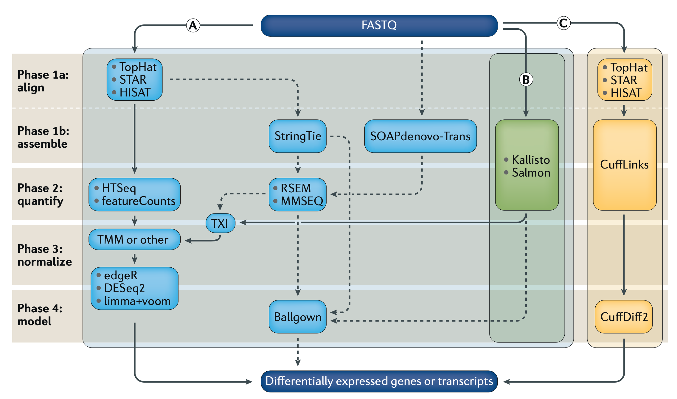
Differential Gene Expression (DGE) is currently the most common use for RNA-seq, where we try to find out which genes from our DNA are expressed differently across cell or sample types as RNA. Because the same machines by Illumina, PacBio, Oxford Nanopore, etc, are used to generate RNA sequencing data, and we need many more reads to get confident pictures of what’s happening across cells, DGE tends to be computationally expensive. As with DNA analysis, sequence alignment is the most time and resource consuming step. If we look at Fig1 above, we see three separate sets of algorithms, pipelines, to go from our raw data (FASTQ files) to our finished answers, we will focus on method (B).

Alignment-free analysis methods are a relatively new breakthrough, and allows us to take our sequencing data coming out of the machines, and skip over the worst part. There are new algorithms and tools coming out all the time, but Kallisto by Páll Melsted and Lior Pachter seems to be the winner for now. It’s also super easy to use. Depending on your OS one of the following commands will install it. Everything you see on this post was done on Linux AWS instances.
MacOS: ruby -e "$(curl -fsSL https://raw.githubusercontent.com/Homebrew/install/master/install)"
brew install kallisto

Linux: conda install kallisto

FreeBSD: pkg install kallisto

NetBSD, RHEL/CentOS: pkgin install kallistoIdeally there’s some pre-processing that should be done on the FASTQ files with our RNA-seq data before jumping into the analysis but let’s leave that up to someone else to explain. Once Kallisto is installed, it will need a transcriptome index. This is very similar to the reference genome used in DNA analysis pipelines. The Pachter Lab provides several pre-built transcriptomes here including H.Sapiens. We can also build our own, after which there’s only one command to do the first part of our analysis.
kallisto index -i transcripts.idx transcripts.fasta.gz

kallisto quant -i transcripts.idx -o output -b 100 reads_1.fastq.gz reads_2.fastq.gz
Believe it or not, at this point Kallisto’s work is done. If we look in the output folder we can find the "abundance.tsv" file. This has our estimated counts of the number of our RNA-seq reads matched to their respective gene transcripts, essentially the more reads that are at a given gene the more that gene is being expressed in our sample/given cell. This is very basic, so there is a more statistically relevant number included in the file, Transcripts Per Million (TPM), which is something people love.

TPM simply shows the rate of counts per base (Xi/li) where we get a measurement of the proportion of transcripts in the pool of RNA, here it is in math.
There are other popular units of measurement like RPKM/FPKM, reads per kilobase per million reads mapped. These can be derived from TPM, so we can skip that for now and move on with our analysis, and the hard/not fun part for me, as shown in Fig1 after Kallisto we move to TXI, TMM, DESq2, etc. But instead we went with Sleuth, which is also made by the Pachter Lab.
Unfortunately, Sleuth is written in R and I hate R. Any way, I guess statisticians love it for their own reasons, so we’ll use it. Let’s start simple by installing Sleuth.
if (!requireNamespace("BiocManager", quietly = TRUE))
    install.packages("BiocManager")
BiocManager::install()
BiocManager::install("devtools")    # only if devtools not yet installed
BiocManager::install("pachterlab/sleuth")
For the sake of building and testing this pipeline, we used 3 sample sets, where one is a tumor sample. Ideally, and the Hadfield et al paper talks about this, you want to use datasets of the same cell type, and have around 6 replicates. You know in an ideal world. Let’s just get the work done and get out of R as fast as we can.
library(sleuth)
sampleNames <- c("onno", "rbab", "twas")
sample_id <- dir(file.path(base_dir))
kal_dirs <- sapply(sample_id, function(id) file.path(base_dir, id))

sampleMetaData <- data.frame(cell=c(rep(c("tumor"), 1), rep(c("normal"), 2)), treatment=rep(c(rep(c("Y"), 1),rep(c("N"), 2)),1))
#this is where we add meta data to our samples

rownames(sampleMetaData) <- sampleNames

sleuth.sampledata <- data.frame(sample=sample_id, cell=sampleMetaData$cell, treatment=sampleMetaData$treatment, path=kal_dirs, stringsAsFactors=F)

sleuth.all <- sleuth_prep(sleuth.sampledata, extra_bootstrap_summary = TRUE)
sleuth.all <- sleuth_fit(sleuth.all, ~cell, 'full')
sleuth.all <- sleuth_fit(sleuth.all, ~treatment, 'reduced')
sleuth.all <- sleuth_wt(sleuth.all, 'cellTumor')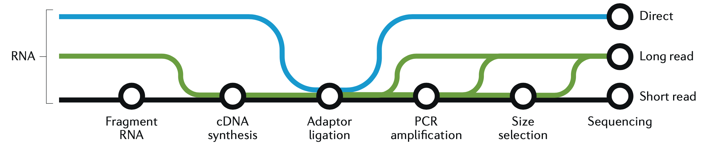
sleuth.all <- sleuth_lrt(sleuth.all, 'reduced', 'full')This is a good place to take a quick graphic break and look at another figure from the great Hadfield paper, before we continue with R and wrap up the analysis. This figure is a visualization of the different forms of RNA-seq reads, from long to short.
In the code block above we loaded Sleuth into R, named our samples, pointed R to our sample directories, added metadata, and actually ran our Sleuth analysis creating several models. Now let’s take a look at those models and filter the results before we make some plots.
> models(sleuth.all)
[  full  ]
formula:  ~cell
data modeled:  obs_counts
transform sync'ed:  TRUE
coefficients:
        (Intercept)
        cellTumor
[  reduced  ]
formula:  ~treatment
data modeled:  obs_counts
transform sync'ed:  TRUE
coefficients:
        (Intercept)
        treatmentY
> tests(sleuth.all)
~likelihood ratio tests:
        reduced:full

~wald tests:
        [ full ]
        cellTumor
sleuth_table <- sleuth_results(sleuth.all, 'reduced:full', 'lrt', show_all = FALSE)
sleuth_significant <- dplyr::filter(sleuth_table, var_obs > 40)
We can see in the models, the data was analyzed based on cell type and whether or not there was any treatment. For the tests we can see that we have likelihood ratio tests as well as a wald test. Afterwards, we place all the results in a table, then we filter those and take our significant results. Mostly I like to filter based on a combination of the following parameters: var_obs: variance of observation, tech_var: technical variance of observation from the bootstraps (named 'sigma_q_sq' if rename_cols is FALSE), sigma_sq: raw estimator of the variance once the technical variance has been removed, smooth_sigma_sq: smooth regression fit for the shrinkage estimation. This seems to bring out differences, and separate out our data in a meaningful way, we can also look closely at the p-value and other parameters which can be found in the Sleuth manual. Using tail, we can see that in this particular case we went from a total of 188753 results, down to only 7. That’s a pretty good needle to hay ratio. So now we can plot our results.
pdf('rplot.pdf')
plot_bootstrap(so, "ENST00000312280.9", units = "est_counts", color_by = "tissue")

plot_pca(so, color_by = ‘cell’)
plot_group_density(so, use_filtered = TRUE, units = "est_counts", trans = "log", grouping = setdiff(colnames(so$samp
le_to_covariates), "sample"), offset = 1)

dev.off()

#using gene names instead of transcripts
mart <- biomaRt::useMart(biomart = "ENSEMBL_MART_ENSEMBL",
  dataset = "hsapiens_gene_ensembl",
  host = 'ensembl.org')
t2g <- biomaRt::getBM(attributes = c("ensembl_transcript_id", "ensembl_gene_id",
    "external_gene_name"), mart = mart)
t2g <- dplyr::rename(t2g, target_id = ensembl_transcript_id,
  ens_gene = ensembl_gene_id, ext_gene = external_gene_name)
sleuth.all <- sleuth_prep(sleuth.all, target_mapping = t2g)
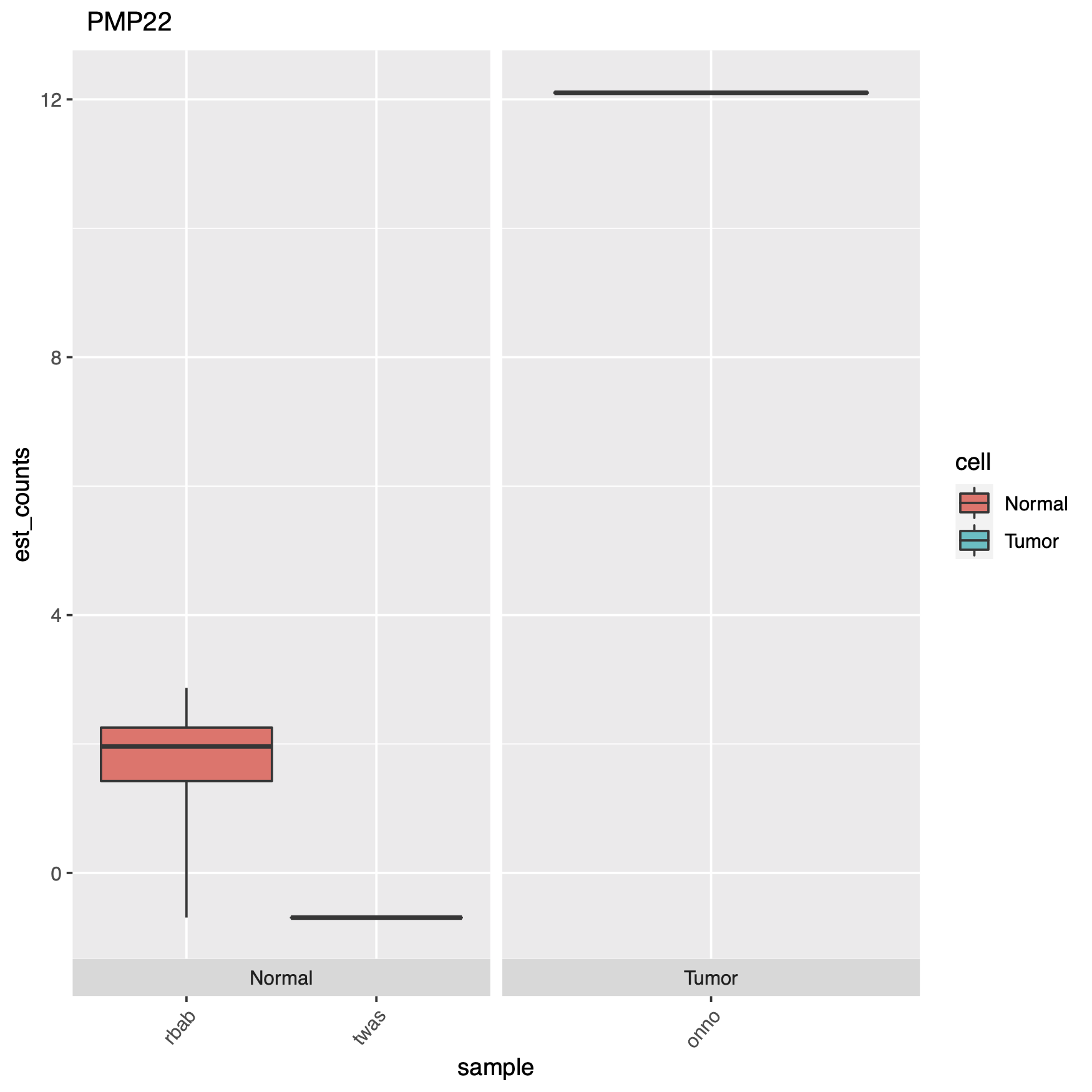
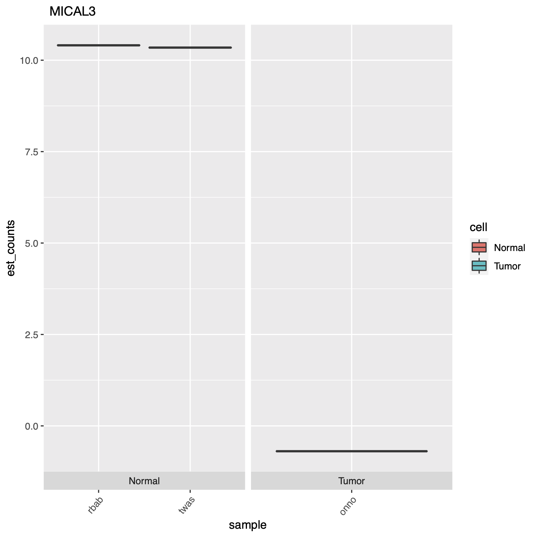
At the end of the code block above where we create our plots, there’s some extra code if you want to see actual gene names in your charts instead of the obscure transcript IDs, which can just as easily be converted with a google copy/paste. Here are some of the plots.


End of the day, this just demonstrates an easy way to set up an RNA-seq DGE analysis, and using a cool new technique which is alignment-free, this saves time & money. But remember it’s always important to have good experimental design, so generating the right data, meaning controls and replicates, as well as testing the right samples & cell types together. Look through the documentation the Pachter lab provides, read the Hadfield paper, and look around online for other sources of help, Harvard FAS Informatics has a good deal of RNA-seq guidance. Any way, good luck, R still sucks.
 Can we use pipelines developed for human NGS analysis and quickly apply them for viral analysis? With ebolavirus being in the news, it seemed like a good time to try. Just as with a human sequencing project, it’s helpful if we have a good reference genome. The NCBI has four different ebola strain reference files located at their ftp:


 &
&  . However these expressions have to be written in Java Expression Language (