Tag Archives: Genomics

Not a Big Deal, GRCh38: A Semi-Casual Comparison of the New Human Reference Genome

Over christmas the Genome Reference Consortium gave all of us doing in silico life-science a wonderful present, or maybe it was just a lump of coal. GRCh38, the newest human reference genome assembly, was released to cheers and jeers abound.

Chromosome 20 Assembly With BWA

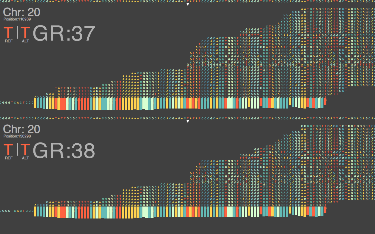
Fig.1: Chromosome 20 Assembly With BWA

Of course, most of us are excited to have up-to-date standards, especially with something like the human reference playing such a pivotal role in clinical adoption of genomics. However, some are lamenting the perhaps inevitable remapping of their NGS reads to this new reference. And it’s completely reasonable to have this worry. Will previous results from samples remain valid once assembled with this new reference, and how different will the sequence alignments be?

Ts/Tv Ratios between GRCh37 & 38

Fig.2: Ts/Tv Ratios between GRCh37 & 38

It will take months and years to thoroughly answer these questions, and notice the complete impact of this update on current NGS data. Consequentially, this does not keep us from starting to get  preliminary ideas of what to expect in the coming years of working with this build. Figure 1 above, shows a nucelotide-level closeup of a BWA sequence alignment of the same dataset, generated on a HiSeq 2500, across the last major release of GRCh37 and the new GRCh38.

Internally we have been using chromosome 20 of human reference builds to benchmark tools and pipelines with datasets; it has a favorable size in terms of length, and not too many curveballs in terms of features.  Figure 2 to the left, shows the Ts/Tv ratios between the two alignments of the same data across the two references to be quite similar at 0.3527 and  0.3445, respectively. Working with the slew of aligners, BWA has repeatedly shown itself to produce reliable results, while avoiding any overly-complex algorithms and trendy implementations. It’s a good workhorse.

Similarly, samtools was used to parse through our SAM/BAM files to produce VCFs with mpileup. Which, again, does not have the most bells and whistles, but is consistently reliable and good for comparing a single variable, in this case, the reference.

High-level Alignment Topology

Fig.3: High-level Alignment Map Topology

Quantifiably, GRCh38 is very similar to the later GRCh37 releases, showing a change rate of  1 change every 159,558 bases on 37.69 and 1 change every 156,779 bases on 38 for our chromosome 20 dataset. Which, to use a technical term, looks pretty damn close. One of the major updates according to the GRC are changes to chromosome coordinates, which some back of the envelope math seems to give a Δ of +19,359 between GRCh37.69 and 38. In combination with one of the other major updates, sequence representation for centromeres, short-reads appear to be spread thinner to cover this difference, resulting in slightly lower depth of coverage versus 37.69. Figure 3 above, shows that overall the alignment map remains mostly similar, at least when BWA is used with standard Illumina reads; with somewhat negligible loss of DP.

Fig.4: Chr20 Annotation of Regional Structure

Fig.4: Chr20 Annotation of Regional Features

By far the largest noticeable change brought to preexisting datasets appears to be related to annotation. Figure 4 above, shows just how hopelessly incongruent GRCh38 is at the moment with current annotation resources, yielding the largest differences to the latest GRCh37 assembly for the same reads. But this was to be expected, annotation will very likely be the last to catch up to this new build, and will improve over months and years.

So, should your project start using GRCh38? The short answer is, not yet. The long answer, it depends on your project resources, pipeline flexibility, and the questions trying to be answered. It’s helpful to remap preexisting NGS data to this new reference, and newly generated datasets would benefit the most, as sequence alignment tends to be the most expensive process in the pipeline to redo. Just keep in mind that for useful results your entire analysis pipeline, which is often an amalgamation of various opensource, commercial, and internal components has to work together. For the time being, GRCh38 is a wrench in the gears for many people, but it has a very promising future.

3 Comments

Filed under Genome Browser, Genomics, LucidViewer

Mapping KEGG Pathway Interactions with Bioconductor

Continuing from the previous post[1], dealing with structural effects of variants, we can now abstract one more level up and investigate our sequencing results from a relational pathway model.

Global Metabolic Pathway Map of H.sapien by Kanehisa Laboratories

Global Metabolic Pathway Map of H.sapien by Kanehisa Laboratories

The Kyoto Encyclopedia of Genes and Genomes (KEGG) has become an indispensable resource which has laboriously, and often manually, curated high-level functions of biological systems. Bioconductor, though not as essential as KEGG, provides some valuable tools when utilizing graph-theory for genomic analysis. If your data is well annotated and you happen to care about high-level genomic interactions, then you may have pathway annotations, containing data like the following:
KEGG=hsa00071:FattyAcidMetabolism;
KEGG=hsa00280:Valine,LeucineAndIsoleucineDegradation;
KEGG=hsa00410:betaAlanineMetabolism;

KEGG IDs can be stored on an external file separate from the sequence data they are derived from. Though, storing the IDs with their respective variant is helpful, and it is possible to maintain VCF 4.1 specifications.

KEGG with VCF 4.1

KEGG Annotations in VCF 4.1

As most Bioconductor tools are based on the R programming language, having an updated installation is recommended, this post uses version 3.0.1 “Good Sport”. Creating interaction maps with KEGG data will require three packages: KEGGgraph, Rgraphviz, and org.Hs.eg.db. These packages can be downloaded as separate tarballs, however installation from within R is likely best:
$R
source("http://bioconductor.org/biocLite.R")
biocLite("KEGGgraph")
library(KEGGgraph)

Using the method above for all three. KEGG relational information is stored within XML files in the KEGG Markup Language. KGML files can be accessed through several methods, including directly from R, FTP, and subjectively the best method with REST-style KEGG API.

Screen Shot 2013-08-27 at 2.26.09 PM
Bioconductor packages downloaded above come with a few KGML files pre-loaded, which can be viewed with the following command, it is also important to note that KGML files we want to use should be placed in this directory to avoid any unnecessary errors.
$R
dir(system.file("extdata",package="KEGGgraph"))
$../Resources/library/KEGGgraph/extdata/

In this post the branched-chain amino acid (BCAA) degradation pathway, which has a KEGG ID of hsa00280, will be mapped in relation to variants from the BCKDHA gene.
$R
[var1] <- system.file(".xml",package="KEGGgraph")
[var2] <- parseKGML2Graph([var1], genesOnly=TRUE)
[var3] <- c("[KEGG-Gene-ID]",edges([var2])$'[KEGG-Gene-ID]')
[var4] <- subKEGGgraph([var3],[variable2])
[var5] <- sapply(edges([var4]), length) > 0
[var6] <- sapply(inEdges([var4]), lendth) > 0
[var7] <- [var5]|[var6]
[var8] <- translateKEGGID2GeneID(names([var7]))
[var9] <- sapply(mget([var8],org.Hs.egSYMBOL),"[[",1))
[var10] <- [var4]
nodes([var10]) <- [var9]
[var11] <- list();
[var11]$fillcolor <- makeAttr([var4],"[color]")
plot([var10], nodeAttrs=[var11])

Executing these steps will result in a graph whose nodes and edges should help clarify any relevant connections between the genomic regions in question.

Screen Shot 2013-08-27 at 5.49.31 PM

Results

While dynamic visualization tools (e.g. Gephi, Ayasdi, Cytoscape) look similar, and with some work utilize KEGG, they may lack the specificity and control which Bioconductor  provides due to its foundations in R. These methods are necessary to understand more than just metabolic diseases, they also play a crucial role in drug interactions, compound heterozygosity/complex non-mendellian traits, and other high-level biological functions.

Leave a comment

Filed under Genomics

Variant Discovery, Annotation & Filtering With Samtools & the GATK

While the UnifiedGenotyper included within the Genome Analysis Toolkit (GATK) provides an ample method by which to call SNPs and indels, mpileup within Samtools still remains a reliable, quick and straightforward way to get variants.

Raw VCF file from Samtools

Raw VCF file from Samtools, notice lack of annotations & filters in the 3rd and 7th columns

To begin we take our assembled bam files created by the method of your choice, two of which are described in the previous posts[1][2].  With newer versions of Samtools the pileup function is replaced by mpileup, they perform the exact same actions; however, in traditional pileup we pass a single individual genome as a bam file for variant discovery, while in mipleup we can pass multiple individuals together and each of their variants are discovered within a single file as the output.

$samtools mpileup -uf [reference.fa] [.bam 1] [.bam 2] [.bam...] | bcftools view -bvcg -> [raw.variant.bcf]
$bcftools view [raw.variant.bcf] > [raw.variant.vcf]

Even though we’re saying the variant discovery is by samtools, all the actual work is being done by bcftools. To learn more about what bcftools can do check out the documentation, all the modules are included as a subdirectory within the samtools package.

Now that we have a VCF file containing all the positions where our samples differ from the reference, and each other, we can begin to utilize the appropriate GATK modules. Starting with annotation:

$java -Xmx[allocate memory] -jar GenomeAnalysisTK.jar -T VariantAnnotator -R [reference.fa] --variant [raw.vcf] --dbsnp [db.vcf] -L [raw.vcf] --alwaysAppendDbsnpId -o [annotated.vcf]

As you can see these one liners can get quite long, but rest assured, the results are worthwhile. If you look carefully at the above command you can see that we’re annotating based on a second VCF file, which in this case is being attained from the NCBI’s dbSNP. Feel free to use whatever database you see fit to generate your annotations.

Annotated VCF, notice rsIDs in 3rd column

Annotated VCF, notice rsIDs in 3rd column

Annotating our raw VCF with a dbSNP file results in flagging any polymorphisms between our sets to be marked with an rsID. These unique identifiers are used to track individual disease phenotypes, which are at various points of experimental validation. However, if we take our mapped genome and search for variations we’ll soon find that there are simply too many variations that show up to make any sense of our data. We have to decrease the size of our haystack before we start looking for our needle. This is where Filtration comes in. A high-level overview of the process can be seen in this previous post which utilizes a key figure from Genomics & Computation (available on iTunes). Below we execute a part of these concepts using GATK:

$java -Xmx[allocate memory] -jar GenomeAnalysisTK.jar -T VariantFiltration -R [reference.fa] --input [input.vcf] -o [output.vcf] --filterExpression "[insert expression]" --filterName "[expression name]"

It is important to understand the one-to-one mapping of filtering expression to the filter name to adequately use this module. A filterExpression should take any number of fields available within the INFO field for any given variation, such as:

AC1=1;AF1=0.5005;DP=130;DP4=3,0,4,3;FQ=3.02;MQ=44;PV4=0.47,0.038,1,0.19;VDB=0.0253

For example the expression could take into account the depth of read as well as the mapping quality, stating 25>DP>10 & 45>MQ>50. However these expressions have to be written in Java Expression Language (JEXL) and are then mapped directly to the following filterName, multiple expression/name combinations can be linked in a single pipe.

Trio Variant Visualization w/ HivePlot

Trio Variant Visualization w/ HivePlot

There are many more steps towards refinement, i.e. recalibration and variant selection, but this blog post is getting quite long. And I think if you follow the roadsigns laid out here the full abilities of both Samtools & the GATK will become evident. The final payoff being reliable, meaningful, and thus useful, NGS data. Hit me up if you get stuck or think my ways are lame.

8 Comments

Filed under Genomics

Exome Sequence Assembly Utilizing Bowtie & Samtools

OG BrowserAt the end of all the wet chemistry for a genome sequencing project we are left with the raw data in the form of fastq files. The following post documents the processing of said raw files to assembled genomes using Bowtie & Samtools.

Raw data is split into approximately 20-30 fastq files per individual

Each of these raw files, once uncompressed, contains somewhere around 1 gigabyte of nucleotide, machine, and quality information. Which will follow the fastq guidelines and look very similar to the following. It’s quickly noticeable where our nucleotide data consisting of ATGC lives within these raw files.

@HWI-ST1027:182:D1H4LACXX:5:2306:21024:142455 1:N:0:ACATTG
GATTTGAATGGCACTGAATATACAGATCAACTTGAAGATAACTGATATCTAAACTATGCTGAGTCTTCTAATTCATGAACACAGTACATTTCTATTTAGG
+
@?<DFEDEHHFHDHEEGGECHHIIIIIGIGIIFGIBGHGBHGIE9>GIIIIIIIIIIIFGEII@DCHIIIIIIGHHIIFEGHBHECHEHFEDFDFDCEE>
@HWI-ST1027:182:D1H4LACXX:5:2306:21190:142462 1:N:0:ACATTG
GCCCTTTTCTCTCCCAGGTGGGAGGCAGATAGCCTTGGGCAAATTTTCAAGCCCATCTCGCACTCTGCCTGGAAACAGACTCAGGGCTATTGTGGCGGGG
+
CCCFFFFFHHHHHJJJJJEGIJHIJJJIJHIJJJJJJJJJJIJJJJIJJJJIJJJJJJIIJHHHFFFFFFEDEEECCDDDDDDDDDDDDDDDEDDBDDB#

At this point the raw reads need to be assembled into contiguous overlapping sets, then chromosomes, and finally the entire genome. There are two general approaches here, template-based and de novo assembly. For this particular exome data set it is prudent to move forward with template-based assembly using the latest build of the human reference genome. An index of the reference genome must be built for bowtie, some indexes are also available for download though the file size can be quite large.

$ bowtie-build /Users/mokas/Desktop/codebase/max/hg19.fa hg19
Settings:
 Line rate: 6 (line is 64 bytes)
 Lines per side: 1 (side is 64 bytes)
 Offset rate: 5 (one in 32)
 FTable chars: 10
...
Getting block 6 of 6
 Reserving size (543245712) for bucket
 Calculating Z arrays
 Calculating Z arrays time: 00:00:00
 Entering block accumulator loop:
 10%
 20%
...
numSidePairs: 6467211
 numSides: 12934422
 numLines: 12934422
Total time for backward call to driver() for mirror index: 02:00:28

The entire reference build should be complete within an hour or two, which may be faster than downloading an pre-built index. At this point the raw fastq file is ready to be processed using our indexed template.

$ bowtie -S [ref] [fastq] [output.sam]

At the end of this step we will have a .sam (Sequence Alignment Map) file, which will have each of our raw reads aligned to certain positions on the human reference. However, the reads will be in no useful order, and all the chromosomes and locations are mixed together.
To be able to move through such a large file with speed and ease it must be converted into a binary format, at which point all the reads can be sorted into a meaningful manner.

$ samtools view -bS -o [output.bam] [input.sam]
$ samtools sort [input.bam] [output.sorted]

We are now left with a useful file where our raw reads are assembled and sorted based on a template.

This file can be visualized and analyzed in a wide variety of available programs, the format is also accessible enough to quickly build your own tools around it. Once each of the 20-30 fastq files in a single sample have been processed in this manner the files can be merged, converted into binary for reduced file size, and indexed for quick browsing. IGV is one of the more useful browsers as a result of its simplicity and ability to quickly jump around all along the genome. Getting a cursory looks at how an assembly went.

Integrative Genomics Viewer

This post is the part of a set providing initial documentation of a systematic comparison of various pipelines with a wide range of algorithms and strategies. Check out the next post in the series on assembly with BWA & Picard.

2 Comments

Filed under Genomics

Virtualization of Raw Experimental Data

Earlier today it was announced that the 2012 Nobel Prize in Physiology/Medicine would be shared by Shinya Yamanaka for his discovery of 4 genes that could turn a normal cell back into a pluripotent cell. 

An effect originally shown by John B. Gurdon with his work on frog eggs over 40 years ago. The NCBI’s Gene Expression Omnibus (GEO) database under accession number GSE5259 contains all 24 candidate genes that were suspected to play a role in returning a cell to a non-specialized state. A practical near-term impact of the research however may be overlooked. That is you can have all of Dr. Yamanaka’s experimental DNA microarray data used in making the prize winning discovery.

Unless you’ve been living under a rock on Mars, or you don’t care what dorky scientists are up to, then you may have heard of the ENCODE project. The Encyclopedia of DNA Elements isn’t winning any Nobel Prizes, not yet anyways, and if what many researchers believe to be true, it never will. All the datasets can be found, spun up, played with, and used as fodder for a new round of pure in silico research from the ENCODE Virtual Machine and Cloud Resource.

What ENCODE and the Nobel Prize in Medicine have in common is ushering in a new paradigm of raw experimental data/protocol/methodology sharing.  ENCODE, which generated huge amounts of varied data across 400+ labs has made all of the raw data available online. They go one step further to provide the exact analytic pipelines utilized per experiment, including the raw datasets, as Virtual Machines. The lines between scientist and engineers are blurring, the best of either will have to be a bit of both. From the Nobel data, can you find the 4 genes out of the 24 responsible for pluripotent mechanisms? Are there similarly valuable needles, lost in the haystack of ENCODE data? Go ahead, give it a GREP through.

Citations:

Leave a comment

Filed under Genomics, Microbiology

Anomaly Detection In The Human Genome

Discovering genomic variations within a single individual, which is also the underlying factor in a previously undiagnosed pathology, can be thought of as a anomaly detection problem. Colloquially referred to as the needle in a haystack.

Multi-pass Exome filtering is illustrated


The NCBI’s human reference genomes allows for the largest filter, enabling identification of initial variants. Next, alternate loci patches to the primary build of the human reference genome, accounting for large regions of variability, will reduce the number of variants, which will still remain too large for efficient annotation. An additional resource taps into SNP databases. The NCBI’s dbSNP provides a large set of SNP locations, meanwhile The National Cancer Institute also contains a large curated database of SNPs which are placed within three categories: Confirmed, Validated, and Candidate SNPs.

Shown in the figure above are three exomes which, after comparison with the primary human reference build contain large variant sets. These are then passed on to alternate loci, and finally SNP filters. The end result being discovery of novel variants, which may be responsible for idiopathic indications.

1 Comment

Filed under Genomics

Common Visualization Methods in Genomics

Because the genome contains such a wealth of information, and in a language which we don’t quite understand, it is of utmost importance to organize it in meaningful ways. As there is no precedent for this syntax, recognizing and documenting adequate patterns is key. Currently there are approximately five conventional methods of visualizing genomic data.

a) Tracks: The bane of academics and government researchers everywhere, sequences represented as rows. Track browsers can display multiple dimensions of the same set of data as well as comparative sets. UCSC Genome Browser is the standard example for this method. However, their usefulness is often limited to close-level, specific targets.

Whole genome exploration and comparison within these browsers tends to be tedious and unfruitful.

b) Heat Maps:  These are likely what the layperson imagines when they think of genomic visualization. Normally encompassing a rectangle containing multi-colored blocks in rows and columns. This method is particularly prevalent amongst microarray data. IGV, the Integrative Genome Viewer can generate heat maps quite well, so can some all-purpose tools such as R Statistics and Gnuplot.

Heat maps have the advantage of providing a larger scale correlative representation of two dimensional data. While still holding on to some of the qualities of track browsing.

c) Circular Genome Maps: A method that attempts to combine the robustness of the track maps in a less overwhelming take. Here strips of data are aligned in concentric circles, making it easier to see possible correlations. Circular maps have shown to be especially helpful recently in showcasing drug/gene interactions. Genome Projector by Arakawa et al. can generate great circular genome maps, amongst other methods.

Circular genome maps have become quite popular of late, as they allow whole genome visualization in a single snapshot. Moreover, multiple dimensions can be represented, as concentric circles.

d) DNA Walks: Are a relatively new method which represent genomic data vectors in a two dimensional plane. Where each letter (A,T,G,C) denotes a direction (up, down, left, right). This method has been helpful in generating a single unique image representative of the sequence in question, and is particularly adapt at showcasing small changes in structural contents, i.e. GC rich regions or poly A tails.

In a DNA walk each base is assigned a direction, i.e. A up, T, down, G left, C right.

e) Network Maps: Originally used to help understand computer networks, this method has quickly proven valuable to systems biology. In viewing the genome, pathways of interactions that were once obscure are allowed to move to the foreground, as well as seeing inherent divisions in function within the genome. The go-to software at the moment is Cytoscape, although Ayasdi is showing to be a wonderful competitor.

One draw back to network mapping genomes, is the likely requirement of annotation. That is, functions must be somewhat defined, raw genomic data is unlikely to be mapped in a meaningful manner with network maps in their current state.

Life science researchers, clinicians, and software engineers all stand to benefit from and are required, for humanity to get a useful grasp on this powerful language. These visualization techniques are, as mentioned, tried and tested. We must learn from, evolve, and iterate them into new tools which strike a balance on imposing our own will on the data and showcasing its inherent, underlying structures.

See:

Previous post “Chaos Game Analysis of Genomes” & work by GeneDrop.

Leave a comment

Filed under Genomics

Chaos Game Analysis of Genomes

Triforce Power

Genomic code that makes us is made up of four letters, ATGC. Billions of these letters together creates a lifeform. Iterated function systems (IFS) are anything that can be made by repeating the same simple rules over and over. The easiest example being tree branches, add a simple structure repeatedly ad-infinitum and before you know it we have complex and beautiful systems; the popular example being the Sierpinski Triangle or “triforce” for the Zelda fans. As the cost of DNA sequencing becomes cheaper day by day we are confronted with a tsunami of data and it has become exceedingly difficult to derive meaningful answers from all the information contained within us.

H. Sapiens

Finding any advantage in ways to organize and view the data helps us discover minuet differences between individuals or say a normal cell versus a cancer cell. This is where Chaos Game Representation (CGR) becomes helpful, CGR is just a form of IFS that is helpful in mapping seemingly random information, that we suspect or know to have some sort of underlying structure.

In our case this would be the human genome. Although when looking at the letters coming from our DNA it seems like billions of random babbles, it is of course organized in a manner to give the blueprint for our bodies.  So let’s roll the dice-  do we get any sort of meaningful structure when applying CGR to DNA? If you are so inclined, something fun to try is the following:

genome = Import["c:\data\sequence.fasta", "Sequence"];
genome = StringReplace[ToString[genome], {"{" -> "", "}" -> ""}];
chars = StringCases[genome, "G" | "C" | "T" | "A"];
f[x_, "A"] := x/2;
f[x_, "T"] := x/2 + {1/2, 0};
f[x_, "G"] := x/2 + {1/2, 1/2};
f[x_, "C"] := x/2 + {0, 1/2};
pts = FoldList[f, {0.5, 0.5}, chars];
Graphics[{PointSize[Tiny], Point[pts]}]

g1346a094 on Chromosome 7

For example, reading the sequence in order, apply T1 whenever C is encountered, apply T2 whenever A is encountered, apply T3 whenever T is encountered, and apply T4 whenever G is encountered. Really though any transformations to C, A, T, and G can be used and multiple methods can be compared. Self-similarity is immediately noticeable in these maps, which isn’t all that surprising since fractals are abundant in nature and DNA after all, is a natural syntax. Being aware that these patterns exist within our data, opens us up to some new questions to evaluate if IFS, CGR and fractals in general are helpful tools in the interpretation of genomic data.

Signal transducer 5B (STAT5B), on chromosome 17

Since the mapping is 1-1 and we see patterns emerge, we are hinted that there may be biological relevance; especially because different genes yield different patterns. But what exactly are the correlations between the patterns and the biological functions? It would also be very interesting to see mappings of introns/exons colored differently or color amino acids and various codons. One thing is for sure, genomes aren’t just endless columns and rows of letters, they are pictures. It is much easier to compare pictures and discover variations, which can ultimately allow us to find meaningful interpretation from this invaluable data.

Citations:

Jeffrey, H. J., “Chaos game visualization of sequences,” Computers & Graphics 16 (1992), 25-33.

Ashlock, D. Golden, J.B., III. Iterated function system fractals for the detection and display of DNA reading frame (2000) ISBN: 0-7803-6375-2

VV Nair, K Vijayan, DP Gopinath ANN based Genome Classifier using Frequency Chaos Game Representation (2010)

6 Comments

Filed under Fractals, Genomics

Cancer, Stress, Genomic Treatments & Steve Jobs

Of the billions of letters making up our life-code a few simple mistakes can cause a cell to stop following the rules, multiply endlessly and destroy it’s host eco-system, you. What can introduce such mistakes in our DNA? The riskiest time being when DNA is copied, a completely molecular-mechanical processes, something that happens billions of times each day in our bodies. It then comes as no surprise that given enough time the likelihood of cancer only increases. However, life is so incredible that it’s managed to develop ingenious ways to spell-check and prevent these mistakes. One of the more rockstar mechanisms are Telomeres, buffer regions at the ends of our chromosomes.

Telomere Caps

Because replication of our chromosomes begins near the center and works itself towards the ends, the two strands of DNA tend not to match up just right at the edges. This is where telomeres reside with their repetitive regions. The idea is it wouldn’t matter if we loose some of them, which is what happens, telomeres shorten over time. Recent research however, has shown strong correlation between the degree of shortening and disease risk, specifically diseases with genomics causes, i.e., cancer. In 2009 the Nobel Prize for Physiology or Medicine was awarded to Elizabeth Blackburn of UCSF for her work in telomeres, including demonstration of the relationship between telomere length, mental stress and cancer.

Genomic Instability and an Increased Incidence of Spontaneous Cancer in Aging mTR−/− Mice

As far as clinical applications of genomics for cancers, two conclusions can be drawn. For prevention, the importance of mental stress in the mechanism of DNA replication. For diagnostics and treatments, the adoption of DNA sequencing both in risk-assessment, i.e., measuring telomere lengths and the use of pharmacogenomics in picking a drug regimen for subjects. Availability of such sequencing technologies is for the moment confined to localities of active genomics industries like San Francisco and the greater Cambridge, Massachusetts region, though often unknown to those in need.
This made me all the more flustered with the failure of clinicians to win Steve Jobs’ battle against cancer. As a case study, he clearly had the resources and lived in an area that is the birthplace of the genomics industry. Jobs was a meticulous individual who was very involved with his work, which leaves us to question his ability to deal with stress and the role that played in his remission & recurrence rates. Another lingering question remains, are the “best” oncologists money can buy, necessarily those who would employ sequencing techniques? Perhaps as time goes on we will learn more about his treatment regiment but for me it shines a bright light in the gap between what researchers see as possible and what clinicians feel comfortable utilizing.

Citations:
Impartial comparative analysis of measurement of leukocyte telomere length/DNA content by Southern blots and qPCR. Nucleic Acids Res. 2011 Aug 8. Aviv A, Hunt Sc, Lin J, Cao X, Kimura M, Blackburn E.

Longevity, Stress Response, and Cancer in Aging Telomerase-Deficient MiceKarl Lenhard Rudolph1, Sandy Chang, Han-Woong Lee, Maria Blasco, Geoffrey J Gottlieb, Carol Greider, Ronald A DePinho

Leukocyte Telomere Length in Major Depression: Correlations with Chronicity, Inflammation and Oxidative Stress – Preliminary Findings. Wolkowitz OM, Mellon SH, Epel ES, Lin J, Dhabhar FS, et al. 2011 PLoS ONE 6(3): e17837.

1 Comment

Filed under Genomics, Meditation, Neuroscience

Drug Development from Binary to Gradient Model

Earlier this year a study by the Center for the Study of Drug Development at Tufts University placed the cost of developing a new drug at $1.3 billion [1].

Distribution of Development Funding

Though the number is contested by other researchers [2], it is well within the trend of pervious studies and has now been widely accepted as an industry wide average. Exacerbating the issue is the all or nothing nature of drug development, where failure during any phase of clinical trials can cause the termination of a project. It is therefore advantageous to consider technologies that will reduce the risk of this binary success/failure model and transition to a gradient definition of therapeutic efficacy.

Trending Costs of Drug Development

Much of the high costs come in during phase 2 & 3 trials, where patient care, clinical production and regulatory leg-work consumes funds at an alarming rate. With everything riding on the individual trial subjects, their well-being directly linked to success. Undesirable reactions to experimental treatments is unavoidable and the margins for serious adverse events is kept tight by regulatory agencies to protect healthcare consumers. Often however, ground-breaking treatments have to be shelved because they affect 10-15% of trial subjects detrimentally.

RD costs of new chemical entity (NCE)

This makes any ability to view trial subjects with increased resolution and discern subtle correlations with their reactions to consumer demographics key in cutting risks of total-loss. Here I hope a story about my own experience is helpful, as I know it better than what anyone else has had to dealt with. My time at Novartis began when I was brought on-board to help with the development of a drug entering a repeat Phase IIB trial, as the first time around approximately 15% of subjects showed an adverse reaction of note.

Draft FDA Guidance on DNA Sequencing & Clinical Trials

Soon however folks began to get cold-feet, do we dump further resources behind this project or cut our losses and iterate to the next project. A third option now becoming available is that perhaps there was something specific to those 15% of patients that caused the unwanted reaction. Identifying this would allow the drug to move along its pipeline with contraindications that covered the failing demographics. No longer limiting projects to pass/fail while hedging development risks.

Citations:
DiMasi et al,(2003) The price of innovation: new estimates of drug development costs
Ernst & Young Global Pharmaceutical Industry Report (2011) Progressions Building Pharma 3.0
Tufts Center for the Study of Drug Development (2011) Outlook 2011 report

Leave a comment

Filed under BigPharma, Genomics