Tag Archives: Bioinformatics

Where Art Meets Science: The Communities Behind Biological Visualizations

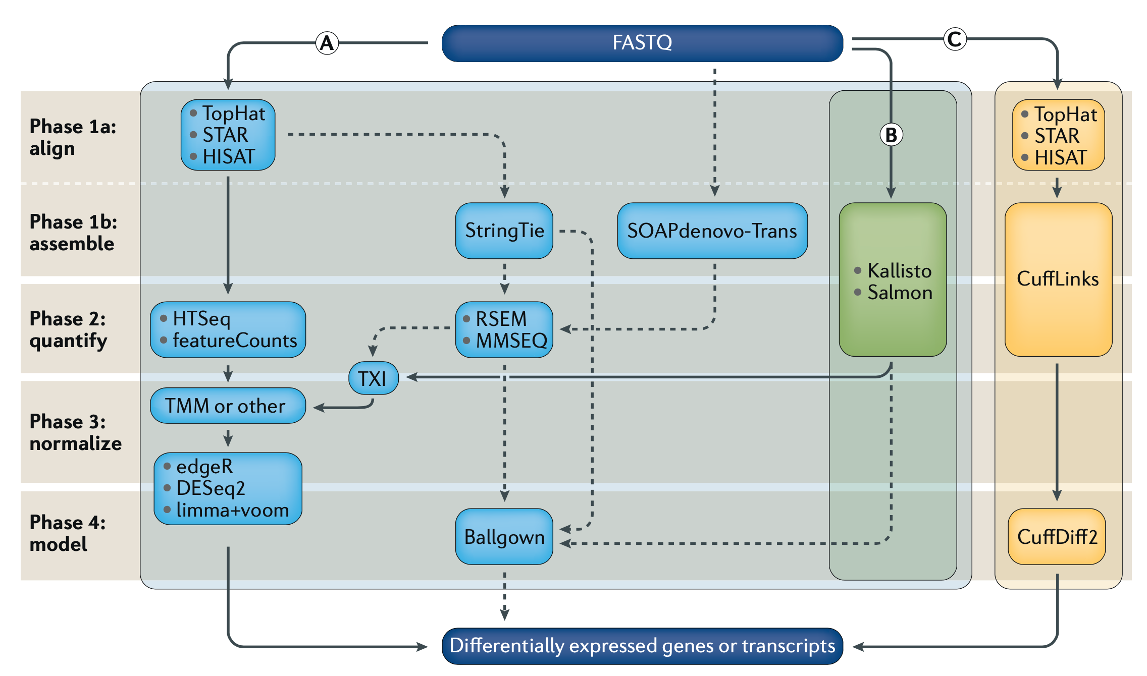
Ever since my time in a crystallography lab, I’ve been fascinated by the process of translating raw diffraction patterns into detailed structural models.

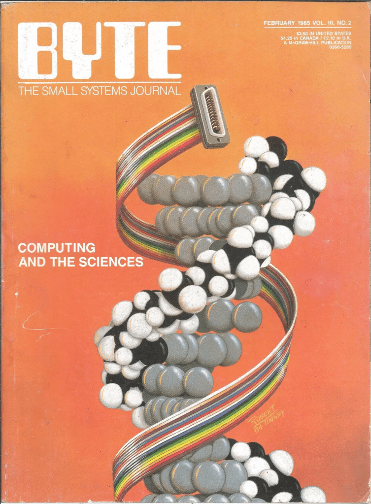
Back then, we relied on those cool SGI (Silicon Graphics, Inc.) computers—high-performance machines that were the go-to for graphics and visualization in the late ’90s and early 2000s. These workstations were the backbone of many scientific labs, enabling us to visualize complex molecular structures in ways that were groundbreaking at the time.

Even at that time, I was captivated by the pursuit of renders that were more than just scientific models—they were almost eye candy, visually arresting representations of the intricate dance of atoms. These weren’t just static arrangements; they were the keys to understanding quantum-scale processes. I found myself wondering: What do these molecular machines really look like? Are they transparent? Gooey?

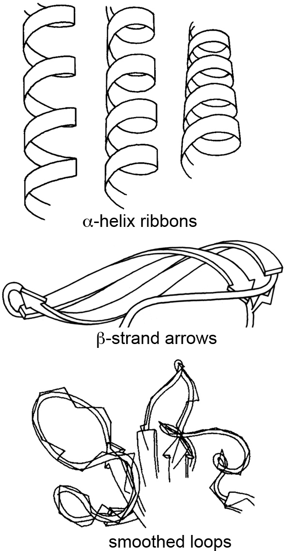
At the time, most people stuck with the ball-and-stick method of molecular rendering, and sometimes the very creative ribbon method for visualizing secondary structures like α-helices and β-sheets. This ribbon method, first introduced by Jane Richardson in the 1980s, revolutionized how we perceive and depict the elegant architecture of proteins.

I was particularly struck by a talk she gave a few years ago at the Machine Learning in Structural Biology (MLSB) workshop, which is part of the broader NeurIPS (Conference on Neural Information Processing Systems). The presentations at MLSB highlight how the intersection of machine learning and structural biology is opening up new avenues for visualizing and understanding complex biological data—building on the foundations researchers laid with creative solutions like the ribbon diagrams decades earlier. You can still view a recording of the entire Richardson talk here.

Fast forward a few years, and I find myself reminiscing about the times when Sonic Youth was the soundtrack to my late-night coding sessions, and I was drawn to ideas about being in the flow, letting go, and just being present in the moment. These days, hanging out with my wife and child brings that same sense of peace and connection. But as much as I cherish these moments, there’s something uniquely exhilarating about attending conferences, where you get to “talk shop” and be exposed to the latest innovations.

I remember the first time I saw molecular renderings by Drew Berry—it was at a VIZBI conference, a gathering that perfectly blends scientific rigor with creative visualization. VIZBI (Visualizing Biological Data) is more than just a conference; it’s an international meeting point for the best minds in science, bioinformatics, and data visualization. What makes VIZBI special is its emphasis on both the scientific and artistic aspects of data visualization.

The conference not only showcases cutting-edge visualizations that transform how life scientists view and interact with data, but it also encourages a deeper appreciation for the aesthetic quality of these visualizations. This was evident in Drew Berry’s work, which brought the molecular world to life in a way I had never seen before. The structures didn’t just sit there; they vibrated, darted around, and had this incredible “stochastic” feel to them, capturing the chaotic energy that defines molecular interactions. It was like seeing the molecules not just as static models, but as living entities, each with its own rhythm and motion. VIZBI isn’t just about keeping up with the latest research; it’s about being inspired, about seeing the boundaries of science and art blur in ways that open up new possibilities for how we understand life at its most fundamental level. It’s the kind of experience that reminds me why I got into this field in the first place.

In the last couple of years, BioVis has really stepped up its efforts to engage the community, working closely with other organizations like IEEE and ISCB to keep the spirit vibrant and interdisciplinary. BioVis has taken on the challenge of pushing forward the frontiers of biological data visualization, encouraging collaboration across fields and nurturing a community that is as diverse as it is innovative.

By bringing together visualization researchers with biologists and bioinformaticians, BioVis has managed to keep the conversation fresh and evolving, ensuring that new methods and ideas keep flowing. It’s exciting to see how these gatherings—both old and new—continue to energize the community and drive progress in understanding the complexities of life at every scale.

And hey, these are just some of the meetings out there, but they are my personal favorites. Even with incredible advancements like AlphaFold, RoseTTAFold, and ColabFold, which have made huge leaps in predicting molecular structures, there is still something uniquely thrilling about the art of representation. For me, that thrill is often fueled by the same sense of awe I get from playing video games. A good game isn’t just about throwing the newest engine at it; it’s about the aesthetics, the art, and the way it all comes together. That’s what makes good games age well—and I think it’s the same with science.

As the saying goes: sometimes, it’s less about where the path leads and more about the wonder found along the way.

Leave a comment

Filed under CS, Microbiology

Alignment-free RNA-seq Differential Gene Expression Analysis with Kallisto & Sleuth


More and more, as we begin to get a solid grasp on DNA sequencing people are finding the need to understand what makes each type of cell different, or what changes occur before/after the introduction of a therapeutic. Of course, the answers are most likely in RNA, as the DNA is our permanent record, and the RNA is what is being worked with at any given moment. So, RNA sequencing has become more and more popular; however, trying to make sense of the data and actually understand what it is our machines are picking up has introduced a whole suite of challenges to overcome.

Differential Gene Expression (DGE) is currently the most common use for RNA-seq, where we try to find out which genes from our DNA are expressed differently across cell or sample types as RNA. Because the same machines by Illumina, PacBio, Oxford Nanopore, etc, are used to generate RNA sequencing data, and we need many more reads to get confident pictures of what’s happening across cells, DGE tends to be computationally expensive. As with DNA analysis, sequence alignment is the most time and resource consuming step. If we look at Fig1 above, we see three separate sets of algorithms, pipelines, to go from our raw data (FASTQ files) to our finished answers, we will focus on method (B).

Alignment-free analysis methods are a relatively new breakthrough, and allows us to take our sequencing data coming out of the machines, and skip over the worst part. There are new algorithms and tools coming out all the time, but Kallisto by Páll Melsted and Lior Pachter seems to be the winner for now. It’s also super easy to use. Depending on your OS one of the following commands will install it. Everything you see on this post was done on Linux AWS instances.

MacOS: ruby -e "$(curl -fsSL https://raw.githubusercontent.com/Homebrew/install/master/install)"
brew install kallisto

Linux: conda install kallisto

FreeBSD: pkg install kallisto

NetBSD, RHEL/CentOS: pkgin install kallisto

Ideally there’s some pre-processing that should be done on the FASTQ files with our RNA-seq data before jumping into the analysis but let’s leave that up to someone else to explain. Once Kallisto is installed, it will need a transcriptome index. This is very similar to the reference genome used in DNA analysis pipelines. The Pachter Lab provides several pre-built transcriptomes here including H.Sapiens. We can also build our own, after which there’s only one command to do the first part of our analysis.

kallisto index -i transcripts.idx transcripts.fasta.gz

kallisto quant -i transcripts.idx -o output -b 100 reads_1.fastq.gz reads_2.fastq.gz

Believe it or not, at this point Kallisto’s work is done. If we look in the output folder we can find the "abundance.tsv" file. This has our estimated counts of the number of our RNA-seq reads matched to their respective gene transcripts, essentially the more reads that are at a given gene the more that gene is being expressed in our sample/given cell. This is very basic, so there is a more statistically relevant number included in the file, Transcripts Per Million (TPM), which is something people love.

TPM simply shows the rate of counts per base (Xi/li) where we get a measurement of the proportion of transcripts in the pool of RNA, here it is in math.

There are other popular units of measurement like RPKM/FPKM, reads per kilobase per million reads mapped.  These can be derived from TPM, so we can skip that for now and move on with our analysis, and the hard/not fun part for me, as shown in Fig1 after Kallisto we move to TXI, TMM, DESq2, etc. But instead we went with Sleuth, which is also made by the Pachter Lab.

Unfortunately, Sleuth is written in R and I hate R. Any way, I guess statisticians love it for their own reasons, so we’ll use it. Let’s start simple by installing Sleuth.

if (!requireNamespace("BiocManager", quietly = TRUE))
    install.packages("BiocManager")
BiocManager::install()
BiocManager::install("devtools")    # only if devtools not yet installed
BiocManager::install("pachterlab/sleuth")

For the sake of building and testing this pipeline, we used 3 sample sets, where one is a tumor sample. Ideally, and the Hadfield et al paper talks about this, you want to use datasets of the same cell type, and have around 6 replicates. You know in an ideal world. Let’s just get the work done and get out of R as fast as we can.

library(sleuth)
sampleNames <- c("onno", "rbab", "twas")
sample_id <- dir(file.path(base_dir))
kal_dirs <- sapply(sample_id, function(id) file.path(base_dir, id))

sampleMetaData <- data.frame(cell=c(rep(c("tumor"), 1), rep(c("normal"), 2)), treatment=rep(c(rep(c("Y"), 1),rep(c("N"), 2)),1))
#this is where we add meta data to our samples

rownames(sampleMetaData) <- sampleNames

sleuth.sampledata <- data.frame(sample=sample_id, cell=sampleMetaData$cell, treatment=sampleMetaData$treatment, path=kal_dirs, stringsAsFactors=F)

sleuth.all <- sleuth_prep(sleuth.sampledata, extra_bootstrap_summary = TRUE)
sleuth.all <- sleuth_fit(sleuth.all, ~cell, 'full')
sleuth.all <- sleuth_fit(sleuth.all, ~treatment, 'reduced')
sleuth.all <- sleuth_wt(sleuth.all, 'cellTumor')
sleuth.all <- sleuth_lrt(sleuth.all, 'reduced', 'full')

This is a good place to take a quick graphic break and look at another figure from the great Hadfield paper, before we continue with R and wrap up the analysis. This figure is a visualization of the different forms of RNA-seq reads, from long to short.

In the code block above we loaded Sleuth into R, named our samples, pointed R to our sample directories, added metadata, and actually ran our Sleuth analysis creating several models. Now let’s take a look at those models and filter the results before we make some plots.

> models(sleuth.all)
[  full  ]
formula:  ~cell 
data modeled:  obs_counts 
transform sync'ed:  TRUE 
coefficients:
        (Intercept)
        cellTumor
[  reduced  ]
formula:  ~treatment 
data modeled:  obs_counts 
transform sync'ed:  TRUE 
coefficients:
        (Intercept)
        treatmentY
> tests(sleuth.all)
~likelihood ratio tests:
        reduced:full

~wald tests:
        [ full ]
        cellTumor
sleuth_table <- sleuth_results(sleuth.all, 'reduced:full', 'lrt', show_all = FALSE)
sleuth_significant <- dplyr::filter(sleuth_table, var_obs > 40)

We can see in the models, the data was analyzed based on cell type and whether or not there was any treatment. For the tests we can see that we have likelihood ratio tests as well as a wald test. Afterwards, we place all the results in a table, then we filter those and take our significant results. Mostly I like to filter based on a combination of the following parameters: var_obs: variance of observation, tech_var: technical variance of observation from the bootstraps (named 'sigma_q_sq' if rename_cols is FALSE), sigma_sq: raw estimator of the variance once the technical variance has been removed, smooth_sigma_sq: smooth regression fit for the shrinkage estimation. This seems to bring out differences, and separate out our data in a meaningful way, we can also look closely at the p-value and other parameters which can be found in the Sleuth manual. Using tail, we can see that in this particular case we went from a total of 188753 results, down to only 7. That’s a pretty good needle to hay ratio. So now we can plot our results.

pdf('rplot.pdf')
plot_bootstrap(so, "ENST00000312280.9", units = "est_counts", color_by = "tissue")

plot_pca(so, color_by = ‘cell’)
plot_group_density(so, use_filtered = TRUE, units = "est_counts", trans = "log", grouping = setdiff(colnames(so$samp
le_to_covariates), "sample"), offset = 1)

dev.off()

#using gene names instead of transcripts
mart <- biomaRt::useMart(biomart = "ENSEMBL_MART_ENSEMBL",
  dataset = "hsapiens_gene_ensembl",
  host = 'ensembl.org')
t2g <- biomaRt::getBM(attributes = c("ensembl_transcript_id", "ensembl_gene_id",
    "external_gene_name"), mart = mart)
t2g <- dplyr::rename(t2g, target_id = ensembl_transcript_id,
  ens_gene = ensembl_gene_id, ext_gene = external_gene_name)
sleuth.all <- sleuth_prep(sleuth.all, target_mapping = t2g)

At the end of the code block above where we create our plots, there’s some extra code if you want to see actual gene names in your charts instead of the obscure transcript IDs, which can just as easily be converted with a google copy/paste. Here are some of the plots.

End of the day, this just demonstrates an easy way to set up an RNA-seq DGE analysis, and using a cool new technique which is alignment-free, this saves time & money. But remember it’s always important to have good experimental design, so generating the right data, meaning controls and replicates, as well as testing the right samples & cell types together. Look through the documentation the Pachter lab provides, read the Hadfield paper, and look around online for other sources of help, Harvard FAS Informatics has a good deal of RNA-seq guidance. Any way, good luck, R still sucks.

Leave a comment

Filed under Genomics

Retooling Analysis Pipelines from Human to EBOV NGS Data for Rapid Alignment and Strain Identification

Screen Shot 2014-10-01 at 12.26.01 PMCan we use pipelines developed for human NGS analysis and quickly apply them for viral analysis? With ebolavirus being in the news, it seemed like a good time to try. Just as with a human sequencing project, it’s helpful if we have a good reference genome. The NCBI has four different ebola strain reference files located at their ftp:

Remote directory: /genomes/Viruses/*
Accession: NC_002549.1 : 18,959 bp linear cRNA
Accession: NC_014372.1 : 18,935 bp linear cRNA
Accession: NC_004161.1 : 18,891 bp linear cRNA
Accession: NC_014373.1 : 18,940 bp linear cRNA

Currently everything that’s happened in West Africa looks to match best with NC_002549.1, the Zaire strain. The Broad Institute began metagenomic sequencing from human serum this summer and the data can be accessed here (Accession: PRJNA257197). We can take some of these datasets and map them to NC_002549.1. The datasets are in .sra format, and must be extracted using fastq-dump.

Coverage map of SRA data from 2014 outbreak in Sierra Leone to the Zaire reference genome.

Coverage map of SRA data from 2014 outbreak in Sierra Leone to the Zaire reference genome.

We can see that the data maps really well to this strain. All four of the reference genomes above were indexed with a new build of bwa(0.7.10-r876-dirty git clone https://github.com/lh3/bwa.git). Because EBOV genomes are so small, compared to humans, the only alignment algorithm which seemed suitable within bwa, was mem.

EBOV mokas$ ./bwa/bwa mem Zaire_ebolavirus_uid14703.fa SRR1553514.fastq > SRR1553514.sam
[M::main_mem] read 99010 sequences (10000010 bp)...
[M::mem_process_seqs] Processed 99010 reads in 8.988 CPU sec, 9.478 real sec
[M::main_mem] read 99010 sequences (10000010 bp)...
[M::mem_process_seqs] Processed 99010 reads in 8.964 CPU sec, 9.671 real sec

If we take the same SRA data and try to map it to some of the other strain references, e.g. the Reston Virginia strain from 1989, it can help give a rough idea of how closely related the 2014 incident is.

Very few regions from 2014 map to the Reston reference

Very few regions from 2014 map to the Reston reference

It can be seen that apart from a few highly conserved regions where many reads align, the coverage map indicates that the data collected in West Africa and sequenced on the Illumina HiSeq2500 does not match to NC_004161.1. There were still approximately 500 variants with the Zaire reference on the 2014 samples, showing a good amount differences, considering the entire genome is only 18,000bp.

Screen Shot 2014-10-01 at 4.11.54 PM

LucidAlign genome browser comparing the two strains


All of this is, of course, good news. We can take sequencing data of new EBOV strains and apply slightly modified pipelines to get meaningful results. And with the Ion PGM now being FDA approved means data can be generated in nearly 3 hours, with Federal approval.Screen Shot 2014-10-01 at 12.58.28 PMThere have even been some publications which show that the protein VP24 can stop EBOV all together [DOI: 10.1086/520582] with the structures available for analysis as well. So, it looks like it’s all coming up humanity, our capabilities are there, and with proper resources this scary little bug can be a thing of history.

Leave a comment

Filed under Genome Browser, Genomics, LucidViewer, Microbiology

Hybrid Assemblies From Short and Long-Reads for INDEL Resolution, Finding The Missing Puzzle Piece

When it comes to genomics, contemporary bioinformatics follows the dogma of, assemble, detect, and annotate. This over-simplification however, washes over many key features, such as insertions and deletions, which may in fact be pathogenic[1].

Screen Shot 2014-05-22 at 12.31.47 PM

Fig 1: A Low Complexity Region, featuring Homopolymers, leading to Ambiguous Mapping

High throughput, NGS short read data, and the algorithms developed to support them have overwhelmingly focused on detection of SNPs, while processing Structural Variants as an afterthought. This has largely been due to the combined limitations of chemistry and computation. Popular sequencers (I’m looking at you Illumina) produce strings with character lengths of several hundred bases. Matching millions of string-sets across highly-repetitive regions, where a single character or pattern of characters repeats over and over, is a nightmare from a algorithm design perspective.

Using Haplotype Calculations with Dindel, SeqAn, and Boost to Resolve INDELs

Fig 2: Using Haplotype Calculations with Dindel, SeqAn, and Boost C++ Libraries to Resolve INDELs

Because scientists and engineers are a lazy bunch with deep-rooted personality flaws, we’ve brushed the problem of sequence alignment in repetitive and low complexity regions under the rug. Sure, most aligners and callers will have some implementation for INDEL realignment, and detection (say Picard or Haplotype Caller in GATK), but if you’ve ever seen the results you know they don’t hold up well to scrutiny. Amongst this, the work of Kees Albers stands out, and anyone who has written a validated pipeline will attest to the results by Dindel’s four step process[2]:

$dindel --analysis getCIGARindels --bamFile sample.bam
        --outputFile sample.dindel_output --ref ref.fa

$python makeWindows.py 
        --inputVarFile sample.dindel_output.variants.txt
        --windowFilePrefix sample.realign_windows
        --numWindowsPerFile 1000

$while count < total.realign_windows:
       dindel --analysis indels --doDiploid 
              --bamFile sample.bam --ref ref.fa
              --varFile sample.realign_windows.2.txt
              --libFile sample.output.libraries.txt
              --outputFile sample.stage2_windows.2
       count +1

$mergeOutputDiploid.py 
        --inputFiles sample.dindel_stage2_out.txt
        --outputFile variantCalls.VCF --ref ref.fa

The process outlined above is quite compute intensive, and as can be seen in Figure 2, the number of possible haplotypes to resolve a single potential INDEL can range in the triple digits; each of which has to be aligned, and selected for by statistical relevance. Guillermo del Angel gives a great outline for those who use GATK (we find the results from Samtools more agreeable) to utilize Dindel, however even this has a fairly significant false positive rate[3].

Fig 3: GATK with Dindel Still has High FPR

Fig 3: GATK with Dindel Still has High FPR

An algorithm, regardless of how well designed, can’t overcome bad input data. And short reads are simply not good starting material for resolving structural variants. Luckily, several companies have taken on the challenge of developing long-read technologies, where the string lengths can reach tens of thousands of characters. We’ve been lucky enough to work with Pacific Biosciences, using data generated with their SMRT hardware and P5-C3 chemistry. Reads in suspected SV regions were extracted, the long reads were used to span the low-complexity/highly repetitive regions, and short reads reassembled using bayesian and HMM methods available in SeqAn and Boost.

At this point I should mention that while Boost is absolutely fabulous in-terms of providing great tools for C++ development, which is a great way to handle compute intensive tasks, it is without a doubt: pull-your-hair-out-frustraiting to build and use. Moreover, while our methods have significantly decreased the number of total SVs in our results, we haven’t had the chance to do a rigorous comparison for FPR; but I think a good way to do that would be similar to what Heng Li has shown recently[4].

Leave a comment

Filed under Genome Browser, Genomics, LucidViewer

Not a Big Deal, GRCh38: A Semi-Casual Comparison of the New Human Reference Genome

Over christmas the Genome Reference Consortium gave all of us doing in silico life-science a wonderful present, or maybe it was just a lump of coal. GRCh38, the newest human reference genome assembly, was released to cheers and jeers abound.

Chromosome 20 Assembly With BWA

Fig.1: Chromosome 20 Assembly With BWA

Of course, most of us are excited to have up-to-date standards, especially with something like the human reference playing such a pivotal role in clinical adoption of genomics. However, some are lamenting the perhaps inevitable remapping of their NGS reads to this new reference. And it’s completely reasonable to have this worry. Will previous results from samples remain valid once assembled with this new reference, and how different will the sequence alignments be?

Ts/Tv Ratios between GRCh37 & 38

Fig.2: Ts/Tv Ratios between GRCh37 & 38

It will take months and years to thoroughly answer these questions, and notice the complete impact of this update on current NGS data. Consequentially, this does not keep us from starting to get  preliminary ideas of what to expect in the coming years of working with this build. Figure 1 above, shows a nucelotide-level closeup of a BWA sequence alignment of the same dataset, generated on a HiSeq 2500, across the last major release of GRCh37 and the new GRCh38.

Internally we have been using chromosome 20 of human reference builds to benchmark tools and pipelines with datasets; it has a favorable size in terms of length, and not too many curveballs in terms of features.  Figure 2 to the left, shows the Ts/Tv ratios between the two alignments of the same data across the two references to be quite similar at 0.3527 and  0.3445, respectively. Working with the slew of aligners, BWA has repeatedly shown itself to produce reliable results, while avoiding any overly-complex algorithms and trendy implementations. It’s a good workhorse.

Similarly, samtools was used to parse through our SAM/BAM files to produce VCFs with mpileup. Which, again, does not have the most bells and whistles, but is consistently reliable and good for comparing a single variable, in this case, the reference.

High-level Alignment Topology

Fig.3: High-level Alignment Map Topology

Quantifiably, GRCh38 is very similar to the later GRCh37 releases, showing a change rate of  1 change every 159,558 bases on 37.69 and 1 change every 156,779 bases on 38 for our chromosome 20 dataset. Which, to use a technical term, looks pretty damn close. One of the major updates according to the GRC are changes to chromosome coordinates, which some back of the envelope math seems to give a Δ of +19,359 between GRCh37.69 and 38. In combination with one of the other major updates, sequence representation for centromeres, short-reads appear to be spread thinner to cover this difference, resulting in slightly lower depth of coverage versus 37.69. Figure 3 above, shows that overall the alignment map remains mostly similar, at least when BWA is used with standard Illumina reads; with somewhat negligible loss of DP.

Fig.4: Chr20 Annotation of Regional Structure

Fig.4: Chr20 Annotation of Regional Features

By far the largest noticeable change brought to preexisting datasets appears to be related to annotation. Figure 4 above, shows just how hopelessly incongruent GRCh38 is at the moment with current annotation resources, yielding the largest differences to the latest GRCh37 assembly for the same reads. But this was to be expected, annotation will very likely be the last to catch up to this new build, and will improve over months and years.

So, should your project start using GRCh38? The short answer is, not yet. The long answer, it depends on your project resources, pipeline flexibility, and the questions trying to be answered. It’s helpful to remap preexisting NGS data to this new reference, and newly generated datasets would benefit the most, as sequence alignment tends to be the most expensive process in the pipeline to redo. Just keep in mind that for useful results your entire analysis pipeline, which is often an amalgamation of various opensource, commercial, and internal components has to work together. For the time being, GRCh38 is a wrench in the gears for many people, but it has a very promising future.

4 Comments

Filed under Genome Browser, Genomics, LucidViewer

Mapping KEGG Pathway Interactions with Bioconductor

Continuing from the previous post[1], dealing with structural effects of variants, we can now abstract one more level up and investigate our sequencing results from a relational pathway model.

Global Metabolic Pathway Map of H.sapien by Kanehisa Laboratories

Global Metabolic Pathway Map of H.sapien by Kanehisa Laboratories

The Kyoto Encyclopedia of Genes and Genomes (KEGG) has become an indispensable resource which has laboriously, and often manually, curated high-level functions of biological systems. Bioconductor, though not as essential as KEGG, provides some valuable tools when utilizing graph-theory for genomic analysis. If your data is well annotated and you happen to care about high-level genomic interactions, then you may have pathway annotations, containing data like the following:
KEGG=hsa00071:FattyAcidMetabolism;
KEGG=hsa00280:Valine,LeucineAndIsoleucineDegradation;
KEGG=hsa00410:betaAlanineMetabolism;

KEGG IDs can be stored on an external file separate from the sequence data they are derived from. Though, storing the IDs with their respective variant is helpful, and it is possible to maintain VCF 4.1 specifications.

KEGG with VCF 4.1

KEGG Annotations in VCF 4.1

As most Bioconductor tools are based on the R programming language, having an updated installation is recommended, this post uses version 3.0.1 “Good Sport”. Creating interaction maps with KEGG data will require three packages: KEGGgraph, Rgraphviz, and org.Hs.eg.db. These packages can be downloaded as separate tarballs, however installation from within R is likely best:
$R
source("http://bioconductor.org/biocLite.R")
biocLite("KEGGgraph")
library(KEGGgraph)

Using the method above for all three. KEGG relational information is stored within XML files in the KEGG Markup Language. KGML files can be accessed through several methods, including directly from R, FTP, and subjectively the best method with REST-style KEGG API.

Screen Shot 2013-08-27 at 2.26.09 PM
Bioconductor packages downloaded above come with a few KGML files pre-loaded, which can be viewed with the following command, it is also important to note that KGML files we want to use should be placed in this directory to avoid any unnecessary errors.
$R
dir(system.file("extdata",package="KEGGgraph"))
$../Resources/library/KEGGgraph/extdata/

In this post the branched-chain amino acid (BCAA) degradation pathway, which has a KEGG ID of hsa00280, will be mapped in relation to variants from the BCKDHA gene.
$R
[var1] <- system.file(".xml",package="KEGGgraph")
[var2] <- parseKGML2Graph([var1], genesOnly=TRUE)
[var3] <- c("[KEGG-Gene-ID]",edges([var2])$'[KEGG-Gene-ID]')
[var4] <- subKEGGgraph([var3],[variable2])
[var5] <- sapply(edges([var4]), length) > 0
[var6] <- sapply(inEdges([var4]), lendth) > 0
[var7] <- [var5]|[var6]
[var8] <- translateKEGGID2GeneID(names([var7]))
[var9] <- sapply(mget([var8],org.Hs.egSYMBOL),"[[",1))
[var10] <- [var4]
nodes([var10]) <- [var9]
[var11] <- list();
[var11]$fillcolor <- makeAttr([var4],"[color]")
plot([var10], nodeAttrs=[var11])

Executing these steps will result in a graph whose nodes and edges should help clarify any relevant connections between the genomic regions in question.

Screen Shot 2013-08-27 at 5.49.31 PM

Results

While dynamic visualization tools (e.g. Gephi, Ayasdi, Cytoscape) look similar, and with some work utilize KEGG, they may lack the specificity and control which Bioconductor  provides due to its foundations in R. These methods are necessary to understand more than just metabolic diseases, they also play a crucial role in drug interactions, compound heterozygosity/complex non-mendellian traits, and other high-level biological functions.

Leave a comment

Filed under Genomics

Variant Discovery, Annotation & Filtering With Samtools & the GATK

While the UnifiedGenotyper included within the Genome Analysis Toolkit (GATK) provides an ample method by which to call SNPs and indels, mpileup within Samtools still remains a reliable, quick and straightforward way to get variants.

Raw VCF file from Samtools

Raw VCF file from Samtools, notice lack of annotations & filters in the 3rd and 7th columns

To begin we take our assembled bam files created by the method of your choice, two of which are described in the previous posts[1][2].  With newer versions of Samtools the pileup function is replaced by mpileup, they perform the exact same actions; however, in traditional pileup we pass a single individual genome as a bam file for variant discovery, while in mipleup we can pass multiple individuals together and each of their variants are discovered within a single file as the output.

$samtools mpileup -uf [reference.fa] [.bam 1] [.bam 2] [.bam...] | bcftools view -bvcg -> [raw.variant.bcf]
$bcftools view [raw.variant.bcf] > [raw.variant.vcf]

Even though we’re saying the variant discovery is by samtools, all the actual work is being done by bcftools. To learn more about what bcftools can do check out the documentation, all the modules are included as a subdirectory within the samtools package.

Now that we have a VCF file containing all the positions where our samples differ from the reference, and each other, we can begin to utilize the appropriate GATK modules. Starting with annotation:

$java -Xmx[allocate memory] -jar GenomeAnalysisTK.jar -T VariantAnnotator -R [reference.fa] --variant [raw.vcf] --dbsnp [db.vcf] -L [raw.vcf] --alwaysAppendDbsnpId -o [annotated.vcf]

As you can see these one liners can get quite long, but rest assured, the results are worthwhile. If you look carefully at the above command you can see that we’re annotating based on a second VCF file, which in this case is being attained from the NCBI’s dbSNP. Feel free to use whatever database you see fit to generate your annotations.

Annotated VCF, notice rsIDs in 3rd column

Annotated VCF, notice rsIDs in 3rd column

Annotating our raw VCF with a dbSNP file results in flagging any polymorphisms between our sets to be marked with an rsID. These unique identifiers are used to track individual disease phenotypes, which are at various points of experimental validation. However, if we take our mapped genome and search for variations we’ll soon find that there are simply too many variations that show up to make any sense of our data. We have to decrease the size of our haystack before we start looking for our needle. This is where Filtration comes in. A high-level overview of the process can be seen in this previous post which utilizes a key figure from Genomics & Computation (available on iTunes). Below we execute a part of these concepts using GATK:

$java -Xmx[allocate memory] -jar GenomeAnalysisTK.jar -T VariantFiltration -R [reference.fa] --input [input.vcf] -o [output.vcf] --filterExpression "[insert expression]" --filterName "[expression name]"

It is important to understand the one-to-one mapping of filtering expression to the filter name to adequately use this module. A filterExpression should take any number of fields available within the INFO field for any given variation, such as:

AC1=1;AF1=0.5005;DP=130;DP4=3,0,4,3;FQ=3.02;MQ=44;PV4=0.47,0.038,1,0.19;VDB=0.0253

For example the expression could take into account the depth of read as well as the mapping quality, stating 25>DP>10 & 45>MQ>50. However these expressions have to be written in Java Expression Language (JEXL) and are then mapped directly to the following filterName, multiple expression/name combinations can be linked in a single pipe.

Trio Variant Visualization w/ HivePlot

Trio Variant Visualization w/ HivePlot

There are many more steps towards refinement, i.e. recalibration and variant selection, but this blog post is getting quite long. And I think if you follow the roadsigns laid out here the full abilities of both Samtools & the GATK will become evident. The final payoff being reliable, meaningful, and thus useful, NGS data. Hit me up if you get stuck or think my ways are lame.

8 Comments

Filed under Genomics

Exome Sequence Assembly Utilizing Bowtie & Samtools

OG BrowserAt the end of all the wet chemistry for a genome sequencing project we are left with the raw data in the form of fastq files. The following post documents the processing of said raw files to assembled genomes using Bowtie & Samtools.

Raw data is split into approximately 20-30 fastq files per individual

Each of these raw files, once uncompressed, contains somewhere around 1 gigabyte of nucleotide, machine, and quality information. Which will follow the fastq guidelines and look very similar to the following. It’s quickly noticeable where our nucleotide data consisting of ATGC lives within these raw files.

@HWI-ST1027:182:D1H4LACXX:5:2306:21024:142455 1:N:0:ACATTG
GATTTGAATGGCACTGAATATACAGATCAACTTGAAGATAACTGATATCTAAACTATGCTGAGTCTTCTAATTCATGAACACAGTACATTTCTATTTAGG
+
@?<DFEDEHHFHDHEEGGECHHIIIIIGIGIIFGIBGHGBHGIE9>GIIIIIIIIIIIFGEII@DCHIIIIIIGHHIIFEGHBHECHEHFEDFDFDCEE>
@HWI-ST1027:182:D1H4LACXX:5:2306:21190:142462 1:N:0:ACATTG
GCCCTTTTCTCTCCCAGGTGGGAGGCAGATAGCCTTGGGCAAATTTTCAAGCCCATCTCGCACTCTGCCTGGAAACAGACTCAGGGCTATTGTGGCGGGG
+
CCCFFFFFHHHHHJJJJJEGIJHIJJJIJHIJJJJJJJJJJIJJJJIJJJJIJJJJJJIIJHHHFFFFFFEDEEECCDDDDDDDDDDDDDDDEDDBDDB#

At this point the raw reads need to be assembled into contiguous overlapping sets, then chromosomes, and finally the entire genome. There are two general approaches here, template-based and de novo assembly. For this particular exome data set it is prudent to move forward with template-based assembly using the latest build of the human reference genome. An index of the reference genome must be built for bowtie, some indexes are also available for download though the file size can be quite large.

$ bowtie-build /Users/mokas/Desktop/codebase/max/hg19.fa hg19
Settings:
 Line rate: 6 (line is 64 bytes)
 Lines per side: 1 (side is 64 bytes)
 Offset rate: 5 (one in 32)
 FTable chars: 10
...
Getting block 6 of 6
 Reserving size (543245712) for bucket
 Calculating Z arrays
 Calculating Z arrays time: 00:00:00
 Entering block accumulator loop:
 10%
 20%
...
numSidePairs: 6467211
 numSides: 12934422
 numLines: 12934422
Total time for backward call to driver() for mirror index: 02:00:28

The entire reference build should be complete within an hour or two, which may be faster than downloading an pre-built index. At this point the raw fastq file is ready to be processed using our indexed template.

$ bowtie -S [ref] [fastq] [output.sam]

At the end of this step we will have a .sam (Sequence Alignment Map) file, which will have each of our raw reads aligned to certain positions on the human reference. However, the reads will be in no useful order, and all the chromosomes and locations are mixed together.
To be able to move through such a large file with speed and ease it must be converted into a binary format, at which point all the reads can be sorted into a meaningful manner.

$ samtools view -bS -o [output.bam] [input.sam]
$ samtools sort [input.bam] [output.sorted]

We are now left with a useful file where our raw reads are assembled and sorted based on a template.

This file can be visualized and analyzed in a wide variety of available programs, the format is also accessible enough to quickly build your own tools around it. Once each of the 20-30 fastq files in a single sample have been processed in this manner the files can be merged, converted into binary for reduced file size, and indexed for quick browsing. IGV is one of the more useful browsers as a result of its simplicity and ability to quickly jump around all along the genome. Getting a cursory looks at how an assembly went.

Integrative Genomics Viewer

This post is the part of a set providing initial documentation of a systematic comparison of various pipelines with a wide range of algorithms and strategies. Check out the next post in the series on assembly with BWA & Picard.

2 Comments

Filed under Genomics

Virtualization of Raw Experimental Data

Earlier today it was announced that the 2012 Nobel Prize in Physiology/Medicine would be shared by Shinya Yamanaka for his discovery of 4 genes that could turn a normal cell back into a pluripotent cell. 

An effect originally shown by John B. Gurdon with his work on frog eggs over 40 years ago. The NCBI’s Gene Expression Omnibus (GEO) database under accession number GSE5259 contains all 24 candidate genes that were suspected to play a role in returning a cell to a non-specialized state. A practical near-term impact of the research however may be overlooked. That is you can have all of Dr. Yamanaka’s experimental DNA microarray data used in making the prize winning discovery.

Unless you’ve been living under a rock on Mars, or you don’t care what dorky scientists are up to, then you may have heard of the ENCODE project. The Encyclopedia of DNA Elements isn’t winning any Nobel Prizes, not yet anyways, and if what many researchers believe to be true, it never will. All the datasets can be found, spun up, played with, and used as fodder for a new round of pure in silico research from the ENCODE Virtual Machine and Cloud Resource.

What ENCODE and the Nobel Prize in Medicine have in common is ushering in a new paradigm of raw experimental data/protocol/methodology sharing.  ENCODE, which generated huge amounts of varied data across 400+ labs has made all of the raw data available online. They go one step further to provide the exact analytic pipelines utilized per experiment, including the raw datasets, as Virtual Machines. The lines between scientist and engineers are blurring, the best of either will have to be a bit of both. From the Nobel data, can you find the 4 genes out of the 24 responsible for pluripotent mechanisms? Are there similarly valuable needles, lost in the haystack of ENCODE data? Go ahead, give it a GREP through.

Citations:

Leave a comment

Filed under Genomics, Microbiology

Anomaly Detection In The Human Genome

Discovering genomic variations within a single individual, which is also the underlying factor in a previously undiagnosed pathology, can be thought of as a anomaly detection problem. Colloquially referred to as the needle in a haystack.

Multi-pass Exome filtering is illustrated


The NCBI’s human reference genomes allows for the largest filter, enabling identification of initial variants. Next, alternate loci patches to the primary build of the human reference genome, accounting for large regions of variability, will reduce the number of variants, which will still remain too large for efficient annotation. An additional resource taps into SNP databases. The NCBI’s dbSNP provides a large set of SNP locations, meanwhile The National Cancer Institute also contains a large curated database of SNPs which are placed within three categories: Confirmed, Validated, and Candidate SNPs.

Shown in the figure above are three exomes which, after comparison with the primary human reference build contain large variant sets. These are then passed on to alternate loci, and finally SNP filters. The end result being discovery of novel variants, which may be responsible for idiopathic indications.

1 Comment

Filed under Genomics